Thursday, February 26, 2015

Sacred Heart Pioneers (2008-12)


Just a quick note: Now that we're entrenched into the off-season, I'll probably limit the new posts to twice a week until August, when football gets on everyone's brain again.

Here's our first "historical" Sacred Heart uniform, which doesn't look dramatically different from the current look -- not a bad thing, because I think Sacred Heart has one of the classiest looks going. The big difference here is the lack of stripes on the helmets and a greater emphasis on gray/silver. And hey, you can seem them in action here, and find some pictures here.

Monday, February 23, 2015

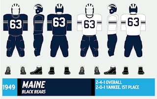
Maine Black Bears (1949-50)


We celebrate this blog's 100th post with a look at the introduction of a helmet that served Maine for 27 seasons.

In 1949, Maine hired David Nelson as its head coach. Nelson was a Michigan man who played for Fritz Crisler, the guy who invented the iconic winged helmet while coaching at Princeton in the 1930s. As a coach, Nelson brought the design to Hillsdale College, where he coach before taking over at Maine, where the winged helmet took flight - and stuck around until 1976, when the team switched to the fat-M helmet under Jack Bicknell.

The 1949 Maine coaching staff. Head coach David Nelson,
the one who looks like a graduate assistant, is third from left.
From the 1951 Prism yearbook (which covered the 1949-50 school year).

The original winged helmet at Maine was leather (plastic shells didn't come until 1951) and the stripes didn't go completely down the back. The blue jersey was actually a holdover from the 1947-48 seasons, while the white shirts and blue pants were completely new (the Black Bears wore blue pants through 1954).

But Nelson delivered more than a new uniform to Maine. He brought a new offense - the Wing-T - and a new assistant in Harold Westerman, who took over as head coach when Nelson departed for Delaware in 1951. "Westy" coached through 1966 and was Maine's athletic director from 1966-82.


The 1949 Black Bears, with new helmets and a new offense, in action.
Also from the '51 Prism.

The 1949 Bears were a strange lot. They shared the Yankee Conference title with a 2-0-1 record, but went 0-3 in State Series play. The State Series, you ask? Well, until the mid-60s, Maine used to play Colby, Bates and Bowdoin every year for a state title, complete with trophy. Don't laugh; it was a big deal for decades, and the Bowdoin games cracked five-digit attendance a few times. In '50, Maine bounced back and won the State Series crown.

I can't find any records of Maine wearing a blue jersey in '50; this doesn't mean the Bears didn't; I just haven't found a picture yet.

Maine players hold David Nelson aloft after his final game, a 6-6 tie
with Bowdoin that clinched the 1950 State Series title. Told ya it was a big deal.
1952 Prism.

The Edward Barrows trophy, emblematic of State Series supremacy, is on the left.
The Yankee Conference bean pot is at center. At right ... well, I guess we know
what Maine did with its live animal mascots after they went to mascot heaven.

Friday, February 20, 2015

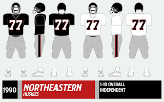
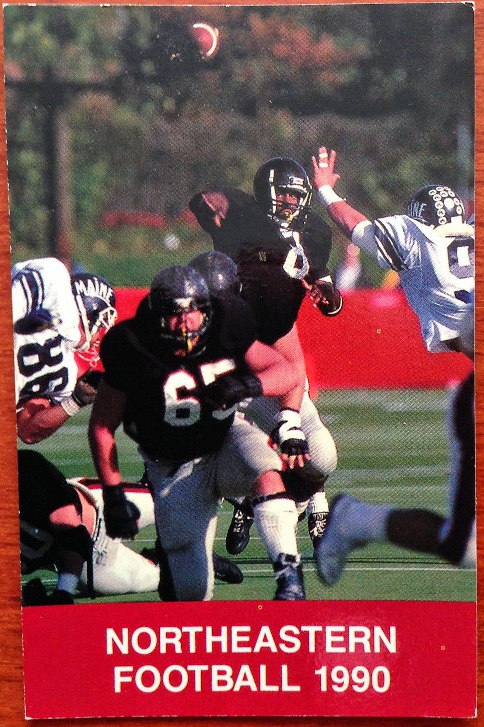
Northeastern Huskies (1989-90)


We wrap up our week of blasé uniforms with my choice for the most blah uniform in this project: the turn-of-the-decade Northeastern Huskies, with plain black helmets, black jerseys that look more at home at practice or in a football scene from a low-budget film and gray pants. They kinda look like the 1990s Atlanta Falcons, minus the logos. The team itself wasn't much better, going 4-17 over two seasons. 

A 1990 Northeastern sked.

In 1991, longtime Boston College fixture Barry Gallup took over as coach and overhauled the uniforms, adding a paw print to the helmets and putting "NORTHEASTERN" in big letters across the jersey front. The jerseys changed many times, but the school name on the shirt was a mainstay (except for the mid-90s), until the program's demise in 2009.


Two pictures of Huskies in front of a gaggle of fans, from the 1991 Caudron yearbook.
The '90 edition, instead of spinning the Huskies' 3-7 1989 season into something positive,
 as yearbooks were wont to do, instead called for the coach
to be fired. It happened, but not for another year.


Wednesday, February 18, 2015

UMass Minutemen (1986-87)


We continue our look at some of the most, er, blah uniforms in this project with a team that just a couple years earlier had, in my opinion, one of the best logos in sports -- the proud minuteman perched between the "U" and the "M," ready to defend the honor of his school, state and football team. But for a few years in the mid-1980s, UMass took a curious step backward.

Under coach Bob Stull, the UMass ditched the minuteman logo in '85 for a generic "UM" logo on the helmet. The gold trim used off and on since the 1940s was discarded, as well (and has never returned, not a bad thing). Under new coach (and former Maine captain!) Jim Reid in '86, UMass took another step backward and used no helmet logo at all. In '87, the Minutemen livened it up by switching the facemask color from gray to maroon.

The graphic shown above shows white socks pulled all the way up, but not all the players wore them that way. By this time, teams were starting to play loose with proper sock wear; this wasn't the NFL.


Somehow, those blank helmets just look strange.
These two pics are from the 1987 UMass Index yearbook.


After sharing a Yankee Conference title in '86, the Minutemen plummeted to a 3-8 mark in '87 before sharing another YC crown in '88 -- this time with the revival of the 1970-72 "UM" logo (see below), which we'll examine at another time. Reid coached the Minutemen through 1991, going 36-29-2.


Well, those maroon facemasks will liven the party.
From the 1988 Index.

A return to glory in 1988. A small "AMHERST"
was added to the logo in '89.

One other note: The basic shirt/pants design was used from 1985-94 and survived through four helmet designs (six if you count the two facemasks used for the blank helmet and the small "AMHERST" added to the "UM" logo in '89). Often, many teams (UNH, Dartmouth, Maine, BC, etc.) stick with one helmet design and change the uniform every few years.

Monday, February 16, 2015

Holy Cross Crusaders (1971)


This week, we're going to profile the most boring uniforms I can find in our little project; I'm talking about outfits that can cure insomnia, the football equivalent of bran flakes. OK, these uniforms aren't as blah as Paterno-era Penn State, but you get the idea.

You could also call this "teams that wore blank helmets after they went out of fashion," and you wouldn't be totally wrong.

Actually, the (dis)honor of the most boring uniform doesn't even go to Penn State; that belongs to the 2004 Bowdoin College Polar Bears, just two towns over from my hometown. Plain black helmets, plain black shirts, plain white pants. It doesn't get any more generic than this, even with the Rebook and paw print logos:


In '05, Bowdoin shocked the football world by adding a stripe down the middle of the helmet. And you thought the Oregon Ducks were revolutionaries.

(No, I'm not adding Bowdoin or any other Division III teams to this project, but I couldn't resist sharing this one. You can find a neat gallery of Bowdoin team photos here.)

We start proper with the 1971 Holy Cross Crusaders, coming off the hepatitis-infected lost season of 1969 and a winless season in '70. Under new coach Ed Doherty, the Saders eliminated the "HC" on their helmets and the striped socks used occasionally the previous year. The result was something akin to a practice uniform, or one of those 1970s Topps football cards with the logos airbrushed off to save a few bucks.


Holy Cross bores the Colgate Raiders into submission in 1971.
From The Crusader.

Holy Cross shocked Harvard 21-16 on opening day for its first win since Nov. 23, 1968 and roared out to a 3-1 start, perhaps because opponents lulled to sleep by the generic unis. The Crusaders cooled off and finished the season 4-6, but Doherty was still named New England coach of the year. Holy Cross (with the "HC" logo restored to the helmets) won five games each of the next three years under Doherty - not great, but considering where the program had been, not too shabby, either.

Friday, February 13, 2015

Holy Cross Crusaders (2004-08)


Silver has been an on-and-off part of Holy Cross' ensemble for decades. From the late 1990s through 2007, the Crusaders wore silver pants at home and purple pants on the road in a variety of designs. This what the Cross wore for the first five years under coach Tom Gilmore (still at the helm of the Crusaders today). For 2005 only, no numbers were used on the helmets, and I haven't the foggiest idea why.

In 2009, the silver was retired and hasn't been seen since. But if the vintage "HC" logo can make a comeback ...

A Holy Cross 2006 media guide, from the number-less season of 2005.

A pair of Holy Cross sleds. These pics were both lifted from eBay listings.

Wednesday, February 11, 2015

Central Connecticut Blue Devils (1968)


Better late than never, a historical uniform from the school previously known as Teachers College of Connecticut, Connecticut State Normal School and Central Connecticut State College until becoming Central Connecticut State University around 1983. CCSU first fielded a football team since 1935, joined Division I in 1993 and entered the Northeast Conference in '96.

Historical info for the Blue Devils is sketchy, at best; I've relied heavily on the now-defunct Dial yearbook for photos (Aren't I glad I used Dial? #rimshot). Some years feature players in home and road uniforms, but most don't. I'm afraid some years are likely lost to history.

The 1968 CCSU uniform (I know it was technically CCSC, but I'm using CCSU to avoid confusion in the marketplace) kinds of looks like a mashup of UConn (jerseys) and UNH (helmets) from this period. The home and road jerseys are quite different: The roads have crew necks, numbers on the sleeves and "BLUE DEVILS" across the top.

The '68 Blue Devils in action. From the 1969 Dial yearbook.

The '68 Blue Devils were 6-2-1 and outscored its foes 152-40. Only American International was able to crack double digits against CCSU, a 14-14 tie. The coach, William Loika, went 94-72-3 from 1964-81 and won four Eastern Football Conference titles. (Aren't I also glad College Football Data Warehouse exists.)

On the road and in the mud.

Monday, February 9, 2015

Brown Bears (1997-2000)


Under new coach Phil Estes, Brown made some tweaks to the brown-and-silver uniforms it had introduced during the Mark Whipple era (1994-96). A brown bear logo replaced the school seal and the jersey numbers were given a double outline.

Two notable things about this style: 

1) The big Ivy League logo patch on the front, which the Bears had worn since '94. No other football team the Ancient Eight wore this on the uniforms, but it was used by teams in other sports (Dartmouth baseball immediately comes to mind).

2) In 2001, Brown completely overhauled the uniform, wearing white helmets with a bear paw on the sides and a simple all-brown uniform. But in 2004, Brown returned to the 1997-2000 uniform in full, the only differences being the addition of a wordmark on the jersey front and narrower jersey numbers. I wonder what was the story behind that one. 

No. 24 was worn by Sean Morey, who holds Brown records for receiving yardage in a season (1,434, 1997) and a career (3,850, 1995-98). He later spent a decade in the NFL as a special-teams ace.

The 2000 Brown media guide. Wire receiver Stephen Campbell (14)
still holds school records for catches in a season (120 in 2000) and a career (205).
One-hundred-twenty catches in 10 games? Damn.

Brown wore this look when it won the Ivy League title in '99, only the second in school history. Estes and the Bears have since added two more Ivy titles to the trophy case.

Elements of this uniform can still be seen in the current look, particularly the dated double-outline numbers. 

More Campbell, on a 2000 schedule.

A couple more skeds.

Friday, February 6, 2015

Cornell Big Red (1999-2001)


From 1990 to about 2005-ish, Cornell's uniforms were pretty basic: Plain red jersey, white numbers with a black outline at home; and white with red numbers and a black outline on the road, all with white pants. But every few years, the Big Red made a few tweaks here and there. 

Here's the turn-of-the-century result of said tweaking, which featured the introduction of a "CORNELL" wordmark just below the collar (wordmarks were just starting to take off at the FCS level at this point). Notice the traditional socks with white bottoms; most college teams had ditched formal matching socks by this time.

A while back, we took a drive-by at the 1994 uniform; feel free to compare.

A Cornell program from 2000, featuring the home uniform ...

... and one from '02 showcasing the '01 roads.

In 2002, the Big Red hopped onto the drop-shadow number bandwagon for a few years, and by 2005 had added shoulder stripes, which they've had ever since -- with a few tweaks here and there, of course.

Wednesday, February 4, 2015

Princeton Tigers (1979-83)

Updated graphic 


After wearing numbers on their helmets in the late 1950s and most of the '60s, the Princeton Tigers burned through quite a few logos over the next several years: A college football 100th anniversary decal, some weird squiggly lines, a CFL-style logo and blank helmets. 

In the middle of the 1979 season, Princeton replaced the blank helmets with an anthropomorphic running tiger that looks more at home in minor league baseball or hockey than Ivy League football. Well, it's different, although you can barely decipher what's on the helmet. The socks, as you can see above, also underwent a period of instability.

Princeton and ... what is that on the helmet? From the Daily Princetonian, 1981.

Amid all the changes, other elements of Princeton's uniform remained downright conservative. The Tigers continued to wear long-sleeved jerseys (complete with awesome tiger stripes) long after short sleeves had become the norm, and black shoes were frequently worn well into the '80s.

Princeton takes on Maine in 1980. That's a random matchup ...

A 1981 Princeton program. It appears as if
No. 78 is wearing a bib or a cut-off practice shirt over his regular jersey. I wonder
what that's all about. Is he wearing a jersey with a different number underneath
and had to change, perhaps?

Princeton battles Penn in 1981. Note No. 32 still wearing black shoes,
a rarity for this time period.


Princeton, minus striped socks, takes on Brown in '83.
And this was the last helmet logo in Princeton history to date. In '84, the Tigers reverted to blank helmets, and have worn "Michigan"-style helmets since '98, although as any Princeton diehard will tell you, Princeton wore Michigan-style helmets before Michigan.

Monday, February 2, 2015

Bryant Bulldogs (2004-06)


Here's another team I haven't done much with -- the Bryant Bulldogs, the baby of this project, having been around only since 1999 and in D-I since 2009.

This is what Bryant wore when it was still a member of the Division II Northeast-10 Conference, which I don't believe has ever had 10 football-playing members, but that's for another time. The '06 team went 8-3, shared the NE-10 title and reached the NCAA D-II tournament. The '07 team repeated the feat, this time claiming the NE-10 title outright.

Looking at pictures from this time period really strikes me as to how much football uniforms have changed over the last decade -- this style predates "revolution" helmets, over-the-top fonts and jerseys and pants that look as if they were spray-painted on the athletes. Funny, 2006 seems as if it were three weeks ago ... Here's the 2014 uniform for comparison.

The patch on the sleeve is the Northeast-10 logo, rendered in Bryant black-and-gold.


The cover of the '06 media guide.