Saturday, January 31, 2015

UNH 2015?

New Hampshire (@UNH_Football) tweeted this out recently while hyping national signing day (or National Signing Day, in some parts of the country):


Notice the navy helmet on the mannequin in the white uniform. Blue helmets have cropped up online the last few years, but have yet to see game action. Something to keep an eye on ... 

Friday, January 30, 2015

Delaware Blue Hens (1989-92)


Regrettably, I haven't done much with Delaware since this project began nearly six months ago. It's kind of a blessing and a curse to keep the same look for decades on end. On one hand, it's pretty cool that the 2014 Blue Hens don't look too different from the 1974 Hens, who don't look to different from the 1954 Hens; on the other, it takes a little fun out of the research. That said, Delaware's commitment to tradition -- and excellence -- is something to be commended.

Speaking of tradition ... In 1989, Delaware celebrated a century of football with a special "Celebrate the Tradition" patch worn on the left shoulder of the home jerseys. For the above graphic, I found a copy of the logo from the '89 UConn media guide, of all places.

The early '90s saw the Hens gradually lower their trademark thin-striped socks until the stripes were all but gone by '93. The number font flip-flopped between the longtime "Champion" font (slanted 2s, curved 7s) and a block number font, which won the day by '94. 

Delaware, with special 100th anniversary patch, takes on Maine in 1989.
From the 1990 Blue Hen yearbook.

The '91 Hens, from the '92 Blue Hen. That is one battle-scarred helmet on the center.
I wonder the initials on the front of the QB's helmet mean?

There's a terrific book out there called 100 Plus: The Story of Delaware Football, which I'd recommend to anyone with even a passing interest in the program. You rarely see such a comprehensive volume devoted to an FCS program. In addition to a straightforward history, there are chapters devoted to their ground-and-pound philosophy, great games, short anecdotes, season-by-season records and even a trivia quiz. Check it out. 

Wednesday, January 28, 2015

Rhode Island Rams (1936-39)


This is the second part of our post inspired by this awesome color clip of Rhode Island playing UMass in 1939. On Monday, we profiled UMass (then Massachusetts State College); today, we look at Rhody (or Rhode Island State as it was known at the time). 

The Rhody helmets from 1936-39 were similar to UMass' in the basic pattern, except the striping stayed separate at the front of the helmet, while UMass' stripes joined at the front.

A nice shot of the 1937 Rhody Rams in action against Brown, from the '38 Grist yearbook.

From the '40 Grist, Rhody takes on Providence in 1939,
two years before the Friars shut down football.

The jerseys are unique; a small number perched on top of the classic "RI" logo, which is still used today. The CFL and the old World League did something like that in the 1990s, albeit a million times gaudier, and didn't Wisconsin and Nebraska do something similar a few years ago? But I've never seen anything like that from this time period.

The blue was closer to electric blue than light blue, not all jerseys had sleeve stripes on the wrists (another unique trait for this period) and the socks changed year to year. I'm not 100 percent about that 1938 road uniform; that's based on a poor photo from the 1939 Grist yearbook.

A Rhode Island player is carted away in 1939.
That's actually a pretty dangerous way to take a player off the field.
This was taken at Brown Stadium; is it me, or is that grandstand HUGE?

The 1939 freshman team, whose players are dressed in whatever
appears to be have been lying around the equipment room. It was common
for freshman/jayvee teams of the era to wear recycled uniforms from seasons past;
Maine's non-varsity teams from the period wore an even more mismatched mishmash.

Monday, January 26, 2015

UMass Statesmen (1938-39)


After stumbling upon this clip recently, I had to add these uniforms to the ol' blog, right?


UMass versus Rhode Island  in 1939... in living color.
What'll they come up with next?


The biggest surprise in this clip of the Massachusetts State College Statesmen (their school name and nickname until after World War II) was the color combo for the home uniforms, which foreshadows the Charley Molnar-era Minutemen by nearly 75 years. When originally researching this era, I always assumed they wore maroon shirts and tan pants, but a second look at black-and-white photos suggests the uniforms were too dark to use that color combo; the game film confirms that.

A description of the UMass-Rhode Island game shown in
the above film clip, from the 1940 Index yearbook. Yup, UMass' teams were known
as the Statesmen before they were the Redmen or Minutemen.

As for the roads ... a little guesswork was used here. For '38, I'm relying on a typical '30s-era yearbook action photo (you stand way over there, and I'll take a photo from way over here). It appears UMass wore plain jerseys; I'm not 100 percent about the color of the numbers.

The '38 road uniform, worn by No. 33 on the left.  From the 1939 UMass Index.

For '39, the jerseys in the photos are clearly not white. Judging from 1940s team photos, they appear to be a rust/tan/gold color, which UMass used as trim off-and-on well into the 1980s. 
The '39 UMass road uniforms in action, from the '40 Index.
Those jerseys definitely aren't white.

By 1940, the pants are noticeably lighter, so I think it's safe to assume they were a rust/gold/tan hue. But to know for certain ... Well, anyone got any more UMass game films lying around?


From 1938 ... It might be interesting to go back there for a week.

We'll look at "Rhode Island State" later in the week.

Friday, January 23, 2015

Vermont Catamounts (1968-69)


For most of the 1960s, Vermont actually had a pretty consistent look in between periods of instability. White helmets with a catamount logo, green jerseys and gold/yellow pants were the order of the decade.

In 1968, Vermont stuck a small gold "V" behind the cat logo, which debuted in 1962. The jerseys, first used in 1965 (at least for the homes; I have no record of what UVM wore on the road in 1965-66) had a "V" on the sleeves. But while the home shirts had no sleeve or shoulder numbers, the roads had numbers that weren't quite on the shoulders, but not quite on the sleeves, either. Yale had something similar in the early 1970s, as did the Pittsburgh Steelers during their 70s dynasty years.

Lining up for the kickoff in 1968, with a little overlap from the team photo.
From the '69 Ariel yearbook.

A really good close-up of the '68 home uniform.

Another nice shot of the home uniform.
Boy, those 1960s players are tiny compared with today.

In 1969, UVM made two small changes: the striping on the pants switched to something akin to the Green Bay Packers, and a small "100" decal was added to the back of the helmet for college football's 100th anniversary. The folks at Helmet Hut depict it as blue with red trim, so that's what I'm going with here.

Speaking of Helmet Hut, you can can read tons more about the late-60s Catamounts here. Good stuff.

This shot's not much, but it's the best one I could find of the
1969 helmet with the "100" decal on the back. Look carefully
and you can find it on the back of the helmet.
From the '70 Ariel.

In 1970, Vermont changed coaches and also switched to gold/yellow helmets, and white pants debuted in mid-season.

Wednesday, January 21, 2015

Northeastern Huskies (1982-86)


During its 77 years of football, Northeastern could never settle on a color combination. Red and white, red and black, black and silver, red and silver, black and white ... Every few years, the Huskies would inevitably change their look. The only constant was the black helmets, and those featured a new logo every few years.

After wearing red jerseys from the late 1960s through 1981, Northeastern donned black shirts with silver pants for the rest of the decade, kind of like the "Dirty Birds" Atlanta Falcons of the 90s. The Huskies first unveiled this look in 1982, but didn't use a compatible road uniform that year; the roads were identical from previous seasons, right down to the jersey names (the home blacks had no names) and white pants. Some schools (Maine made an art out of this) would wait a season to change to matching the road jerseys, presumably for financial reasons, but the Huskies decided to keep the old road pants, as well. At least the socks were consistent; as the decade went on, lower-cut socks became more prominent.


Northeastern schedules from 1984 (top) and 1987 (above).

The 77 for the uniform graphic isn't for the lifespan of the Huskies' program; it was the number worn by Sean "Spider" Jones, who went on to a 12-year NFL career with the Los Angeles Raiders, Houston Oilers (talk about the football graveyard) and Green Bay Packers. He made a pair of Pro Bowls and ended his career on the highest note possible -- a Super Bowl victory in January 1997. 


Sean Jones in 1984, from the '85 Cauldron yearbook. The caption
proved prophetic, but did that "Spider" nickname follow him to the NFL?

Jones' final game was a memorable one, with a Super Bowl victory
over the Patriots. This photo (from an eBay listing) actually brings back sad memories for me ...

Starting in 1987, Northeastern used plain black helmets -- no logo, no stripes, no nuttin' -- for the next few years before a monochrome uniform with the "paw" helmet was introduced in the early 90s.

Next up: A trip to Vermont.

Monday, January 19, 2015

Boston University Terriers (1984-87)


I've been looking for an excuse to run this picture for a while.
The back cover of the 1986 Maine media guide shows the nine Yankee Conference helmets, including newcomers Delaware, Richmond and Villanova. The BU helmet is at center.
Whatever happened to the Bean Pot trophy?

This week, we'll descend into the college football graveyard and look at some more uniforms from three gone-but-not-forgotten programs. Up first, the Boston University Terriers.

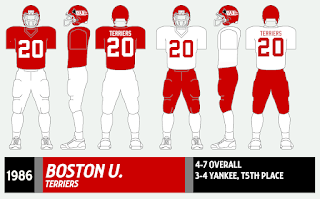
In 1984, BU dumped a cheesy-looking "Boston" wordmark from the helmets and replaced it with the terrier profile logo, which was also the school's general athletics logo and the BU symbol I remember most growing up. (The current cartoony "angry terrier" logo for its sports teams has been used in one form or another since the mid-90s.) The white racing stripes almost, but not quite, wrap around the back of the helmet. The simple shirts and pants from the previous couple seasons remained.

I don't have many photos of BU from the mid-1980s, but here are the Terriers
against two of New England's top running backs from the decade. UNH's Andre Garron,
shown above, is still on the Wildcats' top-10 career rushing list.
From the 1985 Granite yearbook.

Here's BU against Holy Cross' Gil Fenerty (4), still
the Crusaders' all-time leading rusher.
From the Crusader newspaper in '85.

The '84 Terriers, BTW, shared the Yankee Conference title with Rhode Island and reached the NCAA Division I-AA (FCS) Tournament.


In '86, BU kept the helmets, but wore ultra-simple shirts and pants that almost looked like practice uniforms (not the last time that happened with the Terriers). The entire uniform, including the helmet, was overhauled in '88, but the Terrier profile was back on the helmet by '90.

Another photo in which BU is the victim, but it's the best picture I have of the 1986-87 uniform.
This comes from the back cover of the 1987 Maine media guide.

Later this week, we'll stay in the '80s with the Northeastern Huskies.


Friday, January 16, 2015

Columbia Lions (1971-73)


In our journey through these college football uniforms, there may not be a tougher team to document than Columbia. It makes sense; a historically sub-par program typically burns through plenty of coaches, and each one wants to give the team a "fresh" look. 

The early 1970s does a real number on the researcher; the jerseys and even the helmets from this time period often don't match. Throw in an alternate jersey -- uncommon for this era -- and it can cause one to reach for the Aleve (or the store-brand equivalent).

In 1971 and '72, the Lions wore jerseys with two distinct number fonts. And yes, they were worn side-by-side in game action.

No, the number fonts for No. 10 and No. 66 don't match.
From the Oct. 4 1971 Columbia Daily Spectator.
The game was a 22-20 win over Princeton, the Lions' first over
the Tigers since 1945.


But '72 is where it gets really weird. Columbia used a plainer alternate jersey; research shows it was worn only in the early part of the '72 and '73 seasons, which makes me think it may have been a lighter "warm-weather" jersey. All the helmet pictures I've seen show the Detroit Lions logo on the sides and two dark blue stripes down the middle ... except for this one from the Cornell game on Nov. 4.


Doesn't that look like a light blue stripe going down the middle? This is the only image I've seen from '72 with this helmet; with some reluctance, I've added it to the '72 Columbia graphic. (The current Columbia uniform also does funny things with helmet stripes.)

In '73, only one number font was used for the "regular" jerseys, and in '74, the uniform was overhauled (again) and reached some stability for a few years.

A 1973 program. I love that jacket the coach is wearing.

This 1974 program shows the 1973 alternate jersey in action against Princeton.

One other note: The '71 uniform was worn by one of the better Columbia teams in history. The Lions were 6-3 overall, 5-2 in the Ivies and defeated Dartmouth 31-29 on a last-minute field goal a year after the Big Green ran up the score on the Lions (recounted here). It was Columbia's last winning team until 1994.

Yup, figuring out Columbia's uniforms can cause headaches.
From a 29-0 loss to Yale in 1973.
Next week, we're going to return to the college football graveyard and unearth some gems from Boston University, Northeastern and Vermont.