Monday, March 30, 2015

UNH Wildcats (1966-67)


On the heels of a winless 1965 season, New Hampshire hired Dartmouth assistant Joe Yukica as its head coach. Yukica quickly turned the Wildcats around, going 2-6 in 1966 and 5-3 in '67, causing the Granite yearbook to comment that students "may even come to realize what a rally should be like. The first one last fall was so poorly attended that the students barely outnumbered the players." (Of course, this was 1967, and students were too busy concerning themselves with evil and social injustice to worry about a little ol' football team.)

The '67 Wildcats had a lot to celebrate about. From the '68 Granite yearbook.

The uniforms underwent some modifications from '65, with helmet numbers moved to the sides from the back. (In '66, the numbers were only on the right side of the helmets.) In fact, the uniform has that Penn State look to it. Guess where Yukica played his college ball? Judging by photos I've seen, the striped socks weren't worn as much as the short, white models.


The above two photos are from the 1967 Granite yearbook, covering the 1966 season.
Notice the numbers on the right side of the helmet only. The '67 Granite, BTW,
offers these little pearls of wisdom: "By 1987, most of our dreams will be shattered"...
"We will be fat, bald, varicose veined and ugly" ...
"Very few of us will enjoy our work."

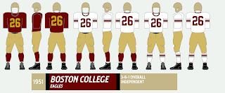
In '68, Yukica moved on to Boston College, but winning football would stick around for a while. And judging by some the crowds in recent years, even the students came to care about football again.

UNH (in white) tries to stop Vermont in 1966.
From UVM's '67 Ariel yearbook.
Other Wildcat uniforms profiled here: 2014, 2010-13, 19981975, 19501947-48. Rivalry Week: Maine-UNH.

Friday, March 27, 2015

Clean-Up Week (Part 3)

OK, one more round of adjustments and corrections.

UMass (1974): Made the road uniform colors more consistent with the homes.


UMass (2013-14): Eliminated the outline around the nameplates. Yes, for all eleven styles worn in 2013. The stuff I do for science.


UNH (1998): Eliminated nameplate around home jersey.


 1994 Yale: Enlarged 125th anniversary patch.


Wednesday, March 25, 2015

Clean-Up Week (Part 2)

OK, time for some more fixes and corrections from previous posts:

Maine (1949-50): Made the road numbers larger.


Maine (1965): Added a white ring around the home shirts' crew neck.


Northeastern (1982): Adjusted the original graphic, which was cut off.


Penn (2013): Added "PENN" wordmark to red shirt.


Princeton (1994): Enlarged 125th anniversary patch.


UConn (1984-88): Adjusted the side belt.


One more round in a couple days.

Monday, March 23, 2015

Clean-Up Week (Part 1)

Hi, and welcome to Clean-Up Week, where we clean up some mistakes from the last seven months. The fixes you see here have also been made on the original posts. So, without further ado ...

Boston College (1984): Made front numbers larger; added Cotton Bowl uniform.


Boston College (1994): Made 125th anniversary patch larger.


Central Connecticut State (1968): Changed V-neck on back of home shirts.


Central Connecticut State (2013-14): Changed V-neck on back of home shirts. Weird I made the same mistake for two totally different shirts for the same school.


Columbia (1996): Changed v-neck on back of home shirts.


Cornell (1994): Made 125th anniversary patch larger.


Fairfield (1996 and 2001): Eliminated the right-side perspective helmet. I dunno, I just thought it looked weird.


More later this week!

Thursday, March 19, 2015

UConn Huskies (1957)


This graphic originally appeared in last November's Rivalry Week post, but I thought it deserved its own freestanding page, so here we go!

Although gold has never been part of their official color ensemble, the UConn Huskies wore gold pants almost every season from 1953-63, with blue pants used frequently, too. Why, I'm not sure; unlike Harvard, there was no direct "carryover" from the leatherhead days of khaki-colored pants. UConn last wore tan/khaki in the early 1940s.

UConn and Delaware stand for the coin toss before a 1957 game,
from the 1958 Nutmeg yearbook. Note the red flag in the ref's back pocket.
Yes, I've posted this before. No, I don't care.
This pic is too cool to not post again.

This is what the Huskies wore in 1957, when they went only 5-4-1 overall, but a 3-0-1 record in Yankee Conference play enabled them to share the YC title with Rhode Island (the story of their showdown for the title is recounted here). The crown was the second of five straight for UConn. Six Huskies were named all-conferene, and back Lennie King was drafted by the Washington Redskins in 1958.

Another UConn-Delaware pic from '57 I posted earlier.

UConn takes on Boston University, wearing the alternate blue pants
and striped socks, which were worn only with the blue pants.
Craving some more UConn unis? Check these out: 2014, 20131984-88, 1971-72, 19701966-67. Rivalry Week: UConn-Rhode Island.

Next week will be "clean-up" week, in which I correct some mistakes made in earlier posts.

Monday, March 16, 2015

Harvard Crimson (1972-73)


What better way to celebrate Harvard's share of the Ivy League basketball title and an NCAA Tournament berth than with ... a football uniform? Well, it's the best I can do.

In 1972, Joe Restic's second year as coach, the Crimson ditched the helmet numbers they had worn under John Yovicsin for a logo ... if you call a generic-looking "H" a logo. Harvard made the switch in season's fourth game, against Cornell, while the jersey, pants and socks retained the look the Crimson had used since the mid-1960s.

The "number" helmet -- two fonts were used in '72 only -- wasn't worn with the white shirts in '72. Amazingly, Harvard wore the whites only once that year, at Princeton. Only two of the Crimson's nine games were on the road, and one was at Columbia, where the visiting team usually wore dark jerseys, presumably to contrast better with Columbia's Columbia-blue jerseys.

The 1972 Crimson wear numbers on the helmets at Columbia ...

... and a big letter "H" a week later against Cornell.
The first pic is from the Columbia Spectator; the second is
form the Cornell Daily Sun.

The "logo" was used until 1974, when Harvard adopted "The REAL Football Centennial" logo. Please tell me in 2014 Harvard breaks out a logo that says "The REAL Football Sesquicentennial."

Harvard breaks out the white jerseys for only time in 1972,
ar Princeton. From the Daily Princetonian.
But wait, there's more! Other Harvard unis you may have missed: 2012-14; 1975-79; 1980-83; 1967-70. Rivalry Week: Harvard-Yale.

Thursday, March 12, 2015

Boston College Eagles (1950-52)


This is is style first touched upon here last fall. There's not really a lot to say about Boston College's uniforms from 1939 through 1967 -- the Eagles' look went through a very slow evolution while maintaining the classic gold helmets, maroon shirts and pants that serve as their basic template to this day. The tall number font shown here was used into the 1960s.

The 1950 Eagles gather 'round the quarterback.
It appears they're mostly wearing plastic helmets.
These pics are all from the Sub Turri yearbook.

The '50 Eagles in action at old Braves Field, which later became
Boston University's home stadium after the baseball Braves left town
and the stadium was given a facelift.

One other note: As we get into the 1950s, plastic helmet shells slowly replace leather helmets as the headgear of choice. It appears from pictures early '50s-pictures that most of the Eagles wore plastic helmets, but most of the mid-50s pics I've seen show them in leather helmets. Strange. I've chosen to use plastic shells here, but there were some "leatherheads" in this era, too. Also note the striped socks worn for a few games in '51 and never seen again.

The 1951 uniform with the short-lived striped socks.

The '52 Eagles getting the lowdown from the press box.
No. 64 appears to have a leather helmet, while No. 63 goes for the plastic model.
Other BC uniforms you may have missed: 2014, 2013, 2007, 1994, 1984, 1982, 1968-77, 1939, Rivalry Week (w/Holy Cross)

Monday, March 9, 2015

Dartmouth Big Green (1936-38)


This is the uniform Dartmouth wore during one of the most successful eras in Big Green history, which is saying something when you look at the team's history. Dartmouth went on a 19-0-3 run during this period, went undefeated in 1937 (7-0-2) and boasted the school's only Heisman Trophy candidate, running back Bob MacLeod, who you can read more about here. The ESPN College Football Encyclopedia (in my meager opinion, one of the five best sports books ever) named MacLeod the greatest player in Dartmouth history.

Bob MacLeod (No. 53; you don't see that number on a running back these days)
takes on Columbia in 1937. The B/W pics here are from eBay listings.

The helmet with gold panels and six green stripes was first introduced in 1934, the year Earl "Red" Blaik -- later the coach of Army's 1940s uber-juggernaut -- became Dartmouth coach. Numbers were added to the jersey front in '36. In 1939, the gray helmet with four stripes was introduced and, with only a few modifications, was worn by Dartmouth through 1954.


Dartmouth and Princeton duke it out n 1937.
Those Tiger unis are pretty sweet.

I touched upon this uniform last fall when writing about the Big Green's uniform history here. And hey, you can see clips of the '38 Big Green in action here.


Dartmouth and Cornell in glorious color (1938).
A screen grab from the above link.
Some other Big Green unis we've profiled: 2014, 2013, 2005-06, 19701955-56, 1951-54.