Wednesday, September 27, 2017

UMass (1930) and Middlebury (1929-30)


In our last post, I promised another bizarre uniform from the late 1920s-early '30s in addition to Vermont's funky garb. Well, I lied: I'll give you two.

While searching through some old Middlebury Kaleidoscope yearbooks for Vermont action photos (Middlebury and UVM were annual rivals in those days), I came across this photo featuring the Panthers and the school that came to be known as UMass:


This might be the most bizarre old-time action photo I've encountered in this project, which is why doing uniform research so much fun and addictive. 

Let's start with the UMass Minutemen -- or the Massachusetts Agricultural College Aggies, as they were known then in the parlance of the time for agricultural schools, or "cow colleges," as they were derisively called. These guys resemble a prison team on the break, anticipating the early Pittsburgh Steelers (nee Pirates) uniforms a few years later. If that wasn't enough, the Aggies (God, that's weird to type) were given matching striped socks, although a couple players wore more conventional hose. 

The 1930 UMass ... Aggies.
I don't know what's more bizarre, the team name or the uniforms.
Better hurry up, the prison guards are coming!
And what's with the guy on the right wearing his shirt like a tank top?

Another oddity to this odd uniform, which was worn only one season: It appears the players wore no numbers on the back, which is kinda ironic for a prison-themed uniform, no? Take a good gander at the blown-up pic below from the 1932 UMass Index yearbook (which covered the 1930-31 school year):


Only stripes cross the back. That might be a relief for embarrassed players who couldn't be identified even with a scorecard. 

Shortly after the season, the school changed its name to Massachusetts State College (a named that lasted only until after World War II), and with it came a new name (the Statesmen) and new uniforms (plain maroon jerseys with numbers on front and back). The Aggies -- and their prison garb -- were never to be spoken of again, except perhaps by Depression-era uni-watchers.

The black helmets on the graphic, BTW, are just a guess on my part. Since UMass wore black helmets in the late 1930s and these lids appear to be a darker hue than the jerseys, I opted to stick with black.

On to Middlebury, which wore some flashy gear of its own in 1930: Big white stripes over a blue jersey. Also note the helmet, which has a white stripe across the sides and the back, but not the front. 

But a little digging shows that might not even be the most oddball uni in Middlebury's arsenal. In 1929, the Panthers used different stripes -- thinner and slightly curved -- on the jerseys. Maybe they were trying to look unique, or perhaps they were getting a jump on Halloween. Hey, football is played in the autumn ...

The inspiration for Middlebury's 1929 uniform?

For at least one game in 1929 (against Williams), Middlebury wore white short-sleeved shirts over the "conventional" jerseys, presumably to prevent confusion on the field since both team were wearing dark uniforms. And it appears these jerseys didn't have numbers, either:


The "skeleton" jerseys were worn from 1928-29, while the, er, less unconventional shirts were worn until the mid-1930s.

On another note, it's hard to believe Middlebury and UMass were once on similar athletic ground. One school wound up in Division III and the other is now playing D-I FBS football. Such was the case in the early years of intercollegiate sports, when teams were just looking for a game against anybody as long as it didn't require a lengthy road trip.

The Middlebury "skeleton" uniforms in action against Vermont, 1929.


Much, much more from UMass: 20162015201420132000-021986-871978-841975-771974197319721966-681960-621953-541951-521938-39. Tribute: Dick McPherson.

And one other uni from Middlebury: 1978.

Thursday, September 21, 2017

Vermont Catamounts (1928-30)


I've been on a leatherhead kick lately, as much of my research lately has been from the pre-World War II era. Some of these uniforms are as wacky as the current models ... almost. But there were some unique ones during the 1920s and '30s, as we'll see here and in our next post. First up, a Vermont uniform right up there with the 1973-74 uni (the program's last) in the uniqueness department. 

Much as Maine's jersey from the same time exhibited a big "M," the Catamounts' jersey bore a big ol' "V" to let everyone know where they're coming from. (Today, they'd probably put an "802" on the front -- seriously, those stickers are on every other vehicle around here, since you can get them at every convenience, grocery and discount store in the state.) The "V" is done in a friction-strip pattern, which was all the rage then, and is surrounded by more friction strips on the sides and sleeves.

The 1928 Vermont uniform, shown in the 1930 Ariel yearbook,
which covered the 1928-29 school year.

The 1928 Catamounts. Some players have the "V," while
others sport a blank jersey.

UVM in action, 1929. In the background is Centennial Field,
which still stands today as the home the Class-A Vermont Lake Monsters.
UVM dropped baseball around 2009.

For 1930, the "V" (in a slightly narrower, taller form) is placed on ... a yellow jersey, which would be the Depression-era version of Oregon placing white names on white jerseys. (I mean, how pretentious is that? That truly makes the Ducks the prog rock of football uniforms.) This style lasted one year before the Catamounts returned to green jerseys.

The 1930 Catamounts. Gold meets gold.
A few more oddities: First, not all the jerseys have the "V" and the friction strips. I wonder if those were optional, or were the fancier jerseys reserved only for seniors/upperclassmen? 

Also, check the helmets. Honestly, I'm not 100 percent on the helmets, but I'm pretty certain the Cats wore a dark helmet in '28, a light helmet in '29 and a two-tone helmet in '30 similar to what Rhode Island wore in the 1940s

I'm not 100 percent about the striping pattern on the gold jerseys, either (gold on gold will do that), but I think I've got it as close as possible. I can't imagine better photos existing beyond what we have from the Ariel yearbooks.

The team -- not shocking, because after all, this is UVM we're talking about -- is far less memorable than the uniform. The '28 team went 1-7-2, with the one win going against someone called the "Medics," who I suspect are students from the UVM medical school (called the Robert Larner College of Medicine these days). The 1930 Ariel notes that the game was not on the original schedule and was added to fill an open date before Thanksgiving. UVM went 2-7 in '29 (no Medics on the schedule) and 1-6-1 in '30, when it was outscored 265-27.

The team may not have been worth the price of admission, but the uniforms sure were.

The 1928 UVM results. Who were those mysterious medics?

UVM faces Middlebury, 1928. Check out the officials' gear!

Want more uniforms from the ol' 802? Of course you do! 1940-42, 1946-48, 1958-611962-631964-671968-691970-74.

The 1930 Ariel yearbook contains little notes scrawled
next to some of the player profiles. Some went to med school,
others ... did not. I'm not certain what happened to Mr. Sirois,
but World War II wasn't far away.

Thursday, September 14, 2017

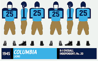
Columbia Lions (1941-45)


As I've probably mentioned before, Columbia is one of the toughest teams to research in this project because of its inconsistency. I have the Lions listed for no fewer than 59 uniform variations (not counting home and road uniforms as separate) from 1934-2016, an average of one uniform change every 1.4 years. Many of them are minor, but massive overhauls have continued well into the 21st century.

But this wasn't always the case in Upper Manhattan. The Lions' uniforms were pretty stable from 1936-45, with only two variations (and even that was minor -- a switch to blue numbers from white). Above is the blue-numbered version. Note the slight difference in the navy shoulder stripes around the collar. Really, Columbia almost resembles a Paleozoic Tennessee Titans here.

Columbia and Princeton -- two of the more
distinctive teams from this era -- face off in 1941. 

Columbia's offense lines up for the photographer in 1941.
Notice how every number ends in 0 or 1.
Perhaps it was an early way to number players by position?


What I like best about Columbia's uniforms from this era -- maybe I've said this before, I forget -- is how they stand out. In a time of dark, muddy, grainy, black-and-white photos, everyone looks the same, and it's a pain trying to determine which team is which. (I'm experiencing this right now while trying to research Vermont's 1930s uniforms, and those are pretty gaudy for that era.) But put Columbia's pale blue duds in there, and Anne Frank can spot those from a mile away (Clerks 2 reference there). Columbia's unis make researching their opponents a gazillion times easier. I wonder if 1940s uni-watchers talked about Columbia's uniforms the way their modern brethren discuss today's stylin'-and-profilin' teams?

A pair of swell posed shots. It appears No. 31
is standing on a plank of some sort to help him face upward
for the camera.

The team itself was wildly inconsistent, as you might expect with a war going on. The Lions were 0-8 in 1943 and scored 33 points all season. (Their opponents matched or exceeded that figure five times that year). Just two years later, they were 8-1 and ranked No. 20 in the nation, with the only loss coming at Penn.

In 1946 Columbia unveiled a revamped uniform with silver helmets and pants and plain light blue jerseys with a silver number. Think Doak Walker-era Detroit Lions.

An action shot from 1944. War-era photos are almost impossible to find
in researching old uniforms, especially for the smaller schools.

Other Lions unis that'll make you roar: 2015-16201420132003-05199619841983, 1978-82, 1974-761971-7319701965-671955-561952-54.

Thursday, September 7, 2017

Cornell Big Red (1931-35)


In an earlier post, I touched upon the antics of former Boston College coach Gloomy Gil Dobie, whose ability to win was surpassed only by his dour personality. Well, before he reached The Heights, Dobie manned the sidelines at Cornell from 1920-35, going 82-36-7 with three straight undefeated seasons while frothing at the mouth all the way (perhaps Dobie was short for Doberman?).

The uniforms from Dobie's final five years in Ithaca show the transitions football uniforms made in the 1930s: The big friction strips on the front (I've always thought of that style as the "Red Grange jersey" for some reason) were phased out for a blank front. As you can see, both styles were used in 1933; I believe there was a mid-season switch. In 1936, Cornell's first season post-Dobie, jersey numbers appeared on the front for the first time.

A really cool 1932 action photo from the 1933 Cornellian yearbook.
Note that No. 51 for Columbia is wearing No. 30's helmet.
"Line play what is?" Who's writing these captions? Yoda?

Gloomy Gil Dobie, flanked by the two jersey styles the Big Red wore that season.

Also note the leather patches on the elbows of the earlier jerseys; they look more at home on a bad 1970s sport coat. 

Ivy League teams are beholden to tradition, and Cornell is no exception: The two white stripes on the sleeves continue to be used well into the 21st century, and the white-striped socks saw several more decades of use, too.


Top: Cornell wears the striped jerseys early in the season (check
the guys on the left). Above: The Big Red, in dark jerseys,
switches to a plainer look against Dartmouth.
As for Gloomy Gil ... a favorite book of my youth, The Football Hall of Shame 2 (go ahead, pick up a copy, it's a perfect bathroom time-killer), has several funny anecdotes about Coach Dobie's days at Cornell and BC. Here are a few quickies:
  • After the Big Red crushed Dartmouth, 59-7, in 1921, Dobie held a full-scale scrimmage right after the game. Why? "Those bums didn't expect to get away with that performance, did they?"
  • After Cornell wrapped up its third straight undefeated season in 1923, Dobie's reaction was, well, Dobie-esque: "If this is a championship team, then the human race must be disintegrating!"
  • In Dobie's final year, 1935 (when Cornell went 0-6-1), his team endured a 54-0 trouncing by Princeton and Dobie told his players to publicly absolve him of any blame. "After all, I'm just the coach," was his reasoning.

A big photo spread of the '34 Big Red,
complete with hokey-but-awesome poses.
After the '35 season, Dobie resigned with three years remaining on his contract. The '36 Cornellian yearbook noted the mixed reaction on campus to his departure, saying that "Ithaca bristled with excitement over the news," while also acknowledging that "the passing of Gilmour Dobie ... was regretted by a host of his loyal supporters, particularly by men who have played under him." I presume that includes those who were called "bums" or were considered signs of the human race's decline.

Can't get enough from the Big Red? Check out these uniforms: 201620152013-141999-200119941985-8919871983-84, 1977-821967-75,  196619651961-6419521950-51. Rivalry week: Cornell-Penn. Inside the Jersey: 1977-79

This unusual photo is from the 1934 Cornellian.
I guess this would be called "modern art" in '34.