Showing posts with label Inside the Jersey. Show all posts

Friday, August 26, 2022

Inside the Jersey: Penn Quakers (1993)


A while back, I used to do an occasional feature where I'd unearth a jersey from my collection and explore the ins and outs of it. Well, this golden oldie somehow fell through the cracks in the AstroTurf. Let's dig in!

The Jersey: 1993 Penn Quakers throwback, worn for one game only (Nov. 20, 1993 against Cornell, the 100th meeting between the ancient rivals). I discussed the uniform a bit in this post. As far as I know, this was the first throwback uniform in college football history. It was worn with Penn's regular helmet and a set of blue pants slightly different from its usual pants, which had stripes on the sides. (Ironically, the original 1970s blue pants had stripes.)

Penn edged Cornell, 17-14, to wrap up a 10-0 season and the Ivy League championship.


How It Was Acquired: eBay, $35. A steal of a deal.

Who Made It: Rawlings, which also made this great Cornell jersey in the late 1970s. When I was young, Rawlings made all the Major League Baseball jerseys, but the company dabbled in football, too.

The mark of a pro ... or whatever college football players are these days.

Who Wore It: Two different players wore No. 64: Linebacker Tim Gage and offensive lineman Jamie Santiago. It's not uncommon for multiple players to simultaneously wear the same number; usually one player is on offense and the other is on defense. 

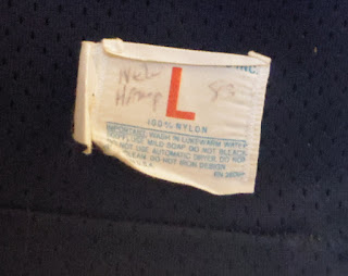
Size: The label reads extra large, but it's probably closer to 2XL or even 3XL. I can wear it comfortably with an undershirt underneath. Today's XL jerseys look like they're spray-painted on the players, they're so tight.

Jersey Constriction: Good old-fashioned made-in-the-USA mesh. No PrimeKnit-HeatGear-TechFit blarney going on here.

The Penn throwback jersey in all its glory. I forget where 
this photo came from, but thanks to whomever used it first.

Design: It's based on the excellent style Penn wore from 1971-80. The numbers and "PENNSYLVANIA" wordmark are taller than on the originals. The Quakers have used the alternating dark red-and-blue sleeve stripes off and on since the 19th century, making it one of football's most enduring uniform characteristics. 

Condition: A little yellowed on the top, with some small stains on the front — possibly from game action, more likely from its current owner eating wings while watching a game on TV.

Other Stuff: The dark red on the sleeves is much closer to maroon, but it seems to match what the Quakers were using on the helmets at the time.

Final Verdict: Let's see ... Historic significance, great design, still fits: Yeah, I'd say this shirt rules.

Monday, October 30, 2017

Inside the Jersey: Northeastern Huskies (1995-96)


Well, it's Halloween, which means it's time for a journey into the football graveyard in search of a treat from a long-lost program. And who do we see scaring up the kiddies but a Northeastern Husky, searching for some long-ago teammates so he can put a team back onto the field? OK, I'm rambling ... "et's go inside the jersey with this mid-90s Northeastern jersey, a style originally profiled here back in early 2016.

The Jersey: Northeastern 1995-96. The '94 style had a College Football 125th anniversary patch on the front, which may or may not have been worn on this one and been removed after the season. Can't tell.

How It Was Acquired: eBay, for about $40. Not bad, considering Northeastern jerseys don't appear that often.

Who Made It: Wilson.

Who Wore It: If my parents hadn't tossed out my old Maine-Northeastern programs from my college days, I could tell you.

Size: XL. This jersey may be from the 1990s, but it has a couple hardcore 80s features: The bottom is cut very high, so you can see which players have innies or outies; and the fishnet mesh pattern, perfect for those November games in 30-degree weather. 

The "2" has shown some wear and tear,
and is a different shape than the "2"s on
the front and back.
Condition: Some definite game use, as evidenced by the worn-out "2" on the sleeve. A photo from a 1990s Cauldron yearbook shows the road versions getting use in practice, so I suspect the homes may also have been recycled, as well. 

Other Stuff: The aforementioned "2" is slanted, while the "2s" on the front and back are straight across. ... The original jerseys had names on the back, and this shirt has some evidence of a nameplate removal ... The Yankee Conference patch on the front is intact. The YC's last year as 1996 before it morphed in the Atlantic 10 the next season ... My jersey is distinctly maroon in color (who made these, Harvard or UMass grads?). I've seen action photos of both maroon and bright red Huskies jerseys.

Ah, the days of the Yankee Conference. Northeastern
tried to join for about 25 years before it finally was admitted
in 1993.

Final Verdict: An odd jersey of a defunct team, perfect for Halloween. 

More Northeastern uniforms from beyond the grave: 2008-09, 1997, 1994-96, 1989-901982-861976-771973-751963-68, 19361935.


Wednesday, August 30, 2017

New Hampshire Wildcats (1979-83)


With Maine and UNH set to open the season against each other this week (and boy, is that strange to type after all those years of the Bears and Cats facing off in the finale), let's take a look at the "classic" New Hampshire uniform of yore, something we started doing in an earlier post

The uniform, which made its debut in 1976, saw its sleeve stripes tweaked in '78 to create a style that went virtually unchanged for more than two decades. If you were even a casual Granite State sports fan in the 1980s or '90s, you're familiar with this uniform. The while "NH" helmet is to fans from that era as the silver lid with the "UNH" wildcat in profile is to the current generation.

Wildcats are scurrying everywhere in the 1979 picture from the Granite yearbook.
Watch out, ref!

The coin toss at Cowell Stadium, 1981.

The only changes were minor: The "NH" helmet logo was enlarged in '84; the facemask went blue in '85; and Champion-made home jerseys were phased out for Wilson models in the mid-90s. The names on the back, as early as the mid-80s, showed some inconsistency with the fonts.

UNH takes on Northeastern, 1983. So many generations of fans
have watched the games from that bank over the years ...

A pair of old UNH media guides. Sadly, they're not mine.

The big oddity comes in the road models, which followed the same template as the homes, but the numbers eschewed the Champion font (curved 7s and diagonal 2s) for a blockier font, indicating they likely were made by someone else.  (This continued even to the final days of this style, when Wilson made the homes and Russell made the roads.) This was not uncommon in baseball (According to William Henderson's exhaustive Game Worn Guide to MLB Jerseys, many hardball teams decades ago used different manufacturers for home and road jerseys), but it seems odd a I-AA/FCS team would do the same thing. The roads also had no manes on the back, unlike the homes -- right up until 2000, the last year these jerseys were worn.

The 1979 UNH road jersey, with the blocker 2s.
BTW, the single-season field goal record is now 18.

And since I have one of these bad boys in my collection, let's do an "Inside the Jersey," shall we?


The Jersey: New Hampshire, 1983, as evidenced by the "NEW HAMP 83" on the tag. 

The "NEW HAMP 83" is scrawled on the tag, showing it's a New Hampshire jersey.
Or maybe it's New Hampton prep school in upstate New Hampshire?
But their colors are green and black, so I'm guessing no.

How It Was Acquired: eBay, about $30. A virtual steal.

Who Wore It: In the words of Allen Ludden on Password Plus, "I haven't the foggiest." But future Steelers fullback and Super Bowl champion Dan Kreider wore No. 44 for UNH in the late 90s.

Who Made It: Champion, as discussed earlier.

Size: A very roomy L. One thing I've discovered in my uniform research/collecting is that not everyone used numbered sizes.

Design: See above.

Condition: Definitely shows some game use, especially on the left sleeve, which shows signs of surgery. I'm guessing this was recycled for the next season or two. The back shows evidence that the name has been removed.


Yup, this one's been through a few wars.

Final Verdict: I'm a Maine guy through and through, but it's still super-cool to own such a historic jersey from a historic program. 

There are plenty more Wildcat uniforms where this came from: 201520142010-13, 2000199819751968-71 (part 1) (part 2)1966-67, 1965 195519501947-4819381936. Rivalry Week: Maine-UNH.

Monday, February 6, 2017

Inside the Jersey: Cornell Big Red (1977-79)


Haven't done one of these in a while. Let's take a closer look at a jersey from my modest collection.

The Jersey: Cornell, 1977-79, the first three years of former Dartmouth legend Bob Blackman's coaching stint in Ithaca.

How It Was Acquired: eBay, about $40-$50. Considering the jersey's vintage and uniqueness, I'd call that a bargain.

Who Wore It: Good question. I found a '77 roster on an eBay program listing, but no No. 53 was listed. Considering the size of the jersey, my money's on a lineman.

And you thought Rawlings was just those guys who handed out the
Gold Glove awards after the baseball season.

Who Made It: Rawlings, a name you don't normally see on football jerseys.

Size: A very roomy XL. My other Rawlings football jersey is the same way.

Jersey Construction: Mesh, mesh, mesh. The team name and numbers are screened on. The screen printing is extremely thick, almost like plastic.

Design: You can read more about that here, but it's definitely different. Curved numbers, long sleeves (although a few teams, like Princeton, also had long sleeves during this period, they were definitely on their way out),  HY-OOGE sleeve numbers and a big ol' CORNELL across the top. The shirt has a rounded neckline, another jersey element that was on its way out by the late 70s. (My original graphic had a v-neck; it's been corrected below).


Condition: Well worn; a few small tears here and there, and one of the numbers is cracking.

Final Verdict: A really unique jersey from a time when the uniforms were better than the team itself. 


Can't get enough from the Big Red? Check out these uniforms: 2016, 20152013-141999-200119941985-8919871983-84, 1977-821967-75,  196619651961-6419521950-51. Rivalry week: Cornell-Penn.


Friday, September 16, 2016

Inside the Jersey: Dartmouth Big Green (1999-2002)


With the Big Green starting up this weekend, let's go Inside the Jersey with this vintage Dartmouth jersey from the turn of the millennium, which seems more like 1,000 years ago these days.

How is was acquired: At an equipment sale in 2012 for a whopping 10 bucks. I bought this and three other Dartmouth football jerseys for $10 each and a game-worn baseball shirt for $25.

Who wore it: WR Evan Fitzpatrick wore No. 25 in 1999, followed by LB Gordon Quist (2000-01) and OL Steven DeMarco (01-02, the Green had two Nos. 25 simultaneously in '01. An offensive lineman wearing a back's number? Who knew?)

Who made it: Wilson, identifiable by the small square logo on the left sleeve. The jerseys with the Wilson tag were made from 1999-2002.

Size: A comfy XL.

Jersey construction: Mesh body, nylon everywhere else.

Design: Clean and simple, with green numbers on the shoulders and Northwestern striping on the sleeves. This was Dartmouth's jersey design from 1987-2002, an eternity by today's standards.

Condition: More hammered than a Dartmouth frat house on a Saturday night. I mean, look at this thing. Tears and rips, stains and stitches; this thing is disintegrating as I touch it. Why is it so beat up? These shirts were recycled for YEARS as jayvee, freshman and practice jerseys. (I'm an editor at the Valley News, Dartmouth's hometown paper, so I've run plenty of practice photos over the years and can attest to this.) No wonder these were $10 each. Hey, at least you know it's been used. 

Yup, this jersey's been through a few battles.

Triviata: This jersey may be battered, but it doesn't stop me from enjoying it and wearing it around town. One day, a guy on a bicycle approached me and said, "Is that a Jets jersey?" My reply: "Nope, Dartmouth." Him: "Oh. I was going to say, that's a tough load to carry." Hey, until the last few years, being a Dartmouth fan was a tough load to carry.

Final verdict: A ripped-to-shreds gamer from an era when Big Green football hit the skids, but still fun to wear. As long as it's not mistaken for a Jets jersey.

Some other unis from the Green Machine: 2015201420132005-062003-04, 1978-861970, 1957-611955-561951-5419441936-38, 1929. Rivalry week: Dartmouth-Princeton.


Thursday, September 1, 2016

Inside the Jersey: Maine Black Bears (2010-13)


With my Black Bears opening tonight at UConn, let's go inside the jersey with this 2010-13 Maine jersey, my personal game day favorite.

How it was acquired: At the Bear Necessities merchandise store inside Alfond Arena last year for $40. I bought three jerseys from a rack of two or three dozen gamers.

Who wore it: Josh Spearin, an offensive lineman, is listed as wearing No. 74 from 2010-12. No one is listed as wearing in in '13.

Who made it: Adidas, which made Maine's jerseys from c. 2009-13.

Size: A nice, roomy 52.

Jersey construction: Mesh body, with polyester/Spandex on shoulders, sides and "sleeves."  Everything is stitched on, which gives the shirt a high-quality look and feel. The bottom is made of elastic, presumably so the shirt won't pop out during the game. The tag reads "+6 LEGNTH," which means it goes down to my knees, like many modern jerseys. The shoulders are cut for pads, and thus is appears I'm have pads underneath whenever I wear the jersey.

Yup, it's a looooong jersey. Were those player ID tags ever used?

Design: This is one of the classier looks Maine has trotted out, and I wish the Bears still wore these today. It's simple and effective, but still has a modern appearance. The only misfire: The blue side panels. (The navy home jersey didn't have alternate colored panels.)

Condition: Pristine, so I'm guessing Mr. Spearin didn't see much game action.

Triviata: The road version of this style debuted a year earlier than the navy home version (2011-13). 

Final verdict: A quality jersey from a quality era when Maine made two NCAA FCS tournament appearances. The current New Balance uniforms are fine, but this is one of the better efforts the Bears ever put out on the field. 


Saturday, August 20, 2016

Inside the Jersey: UConn Huskies (2003)


This is the beginning of an occasional feature in which I unearth a jersey from my modest collection and give it my unbiased opinion (perhaps my favorite of oxymoron in the English vernacular). Today, it's a 2003 UConn Huskies white road jersey, worn by offense tackle Brendan Borowski, according to the '03 roster.

How it was acquired: eBay, for $30, quite the bargain for an FBS jersey.

Who wore it: Brendan Borowski, a backup offensive lineman. His bio, from the 2004 UConn media guide, is below.

Who made it: Aeropostale. Yes, AEROPOSTALE, makers of overpriced apparel for insecure mallrats. I know of no other sports team, high school, college or pro, who wore Aeorpostale uniforms. Some team should have countered with Abercrombie & Fitch unis. (By the way, am I the only one who thinks of 1980s Steelers running back Walter Abercrombie when I think of ol' A&F?)

No, really, Aeropostale! That 1987 on the tag is going to throw off collectors
50 years from now.

Size: 50, but a little snug, as you might expect for modern jerseys, which are not made for casual wear. If you want to spill beer all over your shirt, grab a replica.

Jersey construction: Polyester on the top, sides and "sleeves," single-layer mesh everywhere else. Seems pretty durable. A Big East logo is on the left (despite the fact the Huskies didn't officially join the league until 2004) and the Aeropostale logo (no, really, it was made by Aeropostale) on the right. All numbers are stitched on, and the name is screened onto a stitched nameplate.

Design: Football jerseys were rapidly evolving (or devolving, depending on your point of view), and this was one of the early "out-there" designs. "CONNECTICUT" (the team was trying to emphasize the state name over "UConn" at the time) is arced across the front (something rarely done ever), in contrast to the usual straight-across wordmarks. The stripes on the sleeves and collar reek of busy work, although the "C" on the sides are a nice touch. Check the name on the back: The "W" is lowercase, while the other letters are in all caps!

Condition: Pristine, as you might expect for someone who saw action in only one game in 2003.

Triviata: This was a one-year style (the second straight from the Huskies), although it's very similar to the Nike-manufactured 2004 uni. 

Final verdict: This isn't the prettiest jersey ever made, but it's a unique artifact from a unique period in UConn history, when the Huskies were transitioning into the Big East and moving into their spanking new stadium. And did I mention it was made by Aeropostale? I might have to grab a blue jersey down the road.