Wednesday, January 27, 2016

Maine Black Bears (1985)


Well, it's the ol' blog's 200th post, so let's celebrate with a Maine uniform, shall we?

Under new coach Buddy Teevens in 1985, Maine ditched the dull Penn-State style uniforms worn from 1976-84 in favor of a home shirt reminiscent of of what the Black Bears wore in the late 1950s-early 60s. Player names, absent since 1980, returned. The road shirts had to wait another year to change (a frequent occurrence at Maine), but they also received the name-on-the-back upgrade.

Maine RB Doug Dorsey on the cover of the 1986 media guide.

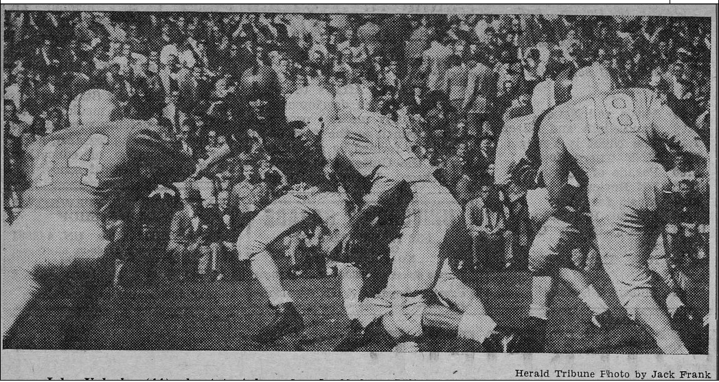
Maine QB Bobby Wilder -- now the head coach at Old Dominion --
with rookie coach Buddy Teevens in 1985. If you look really closely,
you can spot a paw dotting the I on the helmet.

The helmets are the Maine helmets I recall most spending the Saturday afternoons of my youth watching the Bears on Portland's Channel 6 instead of doing something constructive, like go on hikes or dates. The "MAINE" in an arc is rather homely, but it holds some sentimental value to me. You can't really see it in the graphic above, but the "I" is dotted with a paw. Pretty neat! (Triviata: Maine's swim team used the same logo on their swim caps when I attended the school many moons ago.)

The '85 road jerseys continued the 1984 look for another year.

Teevens -- who recently coached his alma mater, Dartmouth, to a share of the Ivy League title -- led Maine from 1985-86, and the Bears achieved their first back-to-back winning seasons since the 1960s. (Triviata 2: Teevens was the youngest D-I football coach in '85. Maine's new coach, Joe Harasymiak, currently holds that distinction.) 

Can't bear to be without Black Bear uniforms? Here are some more: 201520142011-131997-991976-84197519741965more 19651957-591949-501928-29. Rivalry week: Maine-New Hampshire.

My copy of the '86 media guide, signed by Buddy Teevens in 2008.
Damn right it's framed.

Monday, January 25, 2016

Cornell Big Red (1952)


Cornell's 1952 unis are very similar to the 1950-51 versions, except the Big Red exclusively wore white pants on the road, saving the grays for home. The gray pants, of course, live on today, although I prefer the whites. 

I'd still love to know the story as to why Cornell used two different helmet designs, although other teams (paging Rhody) did something similar during the time period. Perhaps the Big Red kept the older striped helmets around as a way to save money, while the newer helmets had the "stripe-less" look? As the voice in the Tootsie Pop ad says, the world may never know.

Cornell on the road at Colgate, 1952.

Against Syracuse -- yes, THAT Syracuse -- in '52.
Note the two different helmet designs on the Cornell players.
Can't get enough from the Big Red? Check out these uniforms: 2013-141999-200119941985-891983-84, 1977-821967-7519651961-64, 1950-51. Rivalry week: Cornell-Penn.

Thursday, January 21, 2016

Princeton Tigers (1947-48)


Consistency is a double-edged sword in this project. Keeping the same look for years is a great tribute to tradition, but it also can suck some of the fun out of research. But it's still pretty cool to look at Princeton's late-40s uniform and see how little it changed until the 1970s. The orange helmet with the black stripe, the black tiger-striped shirt with white numbers, the light gray pants -- the basic template was in place by '47. Only a few minor changes (helmet numbers, face masks) were made over the next two decades or so. 

Princeton and Brown face off in 1947.
Those Tiger numbers need their own zoning ordinance, they're so big. 

Against Penn, 1947. Daily Princetonian pix, BTW.

There was no road jersey -- for some reason, many Ivy League schools (Princeton, Harvard, Yale, Columbia) considered it blow their dignity to have a white jersey, perhaps because they played so many home games back then. And check out the numbers on the back -- they're HY-OOGE! They shrank in '49.

Against Rutgers, 1948, a zillion years before the Knights joined
the Big Ten -- or B1G for those who watch too much ESPN.

On the prowl for more Princeton? Check these out: 2014201319961993-95, 1994,  1987-901984-861975-771979-831970-72, 1945-46. Rivalry week: Dartmouth-Princeton.

Monday, January 18, 2016

Columbia Lions (1952-54)


Like many other teams in the early 1950s, Columbia wore one jersey home and away, although the Lions continued to do so on and off into the '60s. This particular design has numbers that bring the vintage Dallas Cowboys to mind, and pants that changed stripes every year (random). 

Also note the outlines on the jersey numbers, a rare occurrence for the era.


Columbia in action in 1952 (top) and '53 (above., both from the Columbia Spectator.
During the 50s, Spec game photos were about as common as Columbia wins, har-har. 

This was toward the end of the illustrious reign of coach Lou Little, although great moments like the 1934 Rose Bowl win and the 1947 upset of Army that ended the Cadets' 32-game winning streak were long in the rear view -- the Lions were 7-19-1 from 1952-54.

Other Lions unis that'll make you roar: 2015201420132003-0519961974-761971-7319701965-67.

Thursday, January 14, 2016

Rhode Island Rams (1963-65)


With the NFL Rams' imminent return to Los Angeles in the news this week, I thought the time was appropriate to take a look at those other Rams and a uniform that bore a striking resemblance to those of their Left Coast brethren.

Rhody (left) takes on UNH in 1963. The guy on the left is either about
to make a spectacular catch or a spectacular near-catch.

Merlin Olsen of the LA Rams, who wore a slightly lighter shade
of blue than their Rhody namesakes.

Rhode Island's 1963-65 uniform mirrors those the NFL Rams wore from 1964-72, which means Rhody beat LA to the punch. Clearly, when the LA Rams were looking to make a change, they searched far and wide for inspiration and finally found it in bucolic Kingston, R.I.

OK, maybe not.

1964.
1965.

I still prefer the late-60s version of the uniform, just because when I think of Rhody, I think light blue, but this uniform is perfectly acceptable.

There are more uniforms out there from Rhody: 201420131997-991983-921976-821967-711966, 19621957-611936-39. Rivalry Week: UConn-Rhody.


Monday, January 11, 2016

Boston College Eagles (1978-80)


Don't you hate it when you have a bad day or go through a rough patch and someone tells you, "Hey, it could be worse?" Well, that could be the case with Boston College this past season after winning only three games -- two versus FCS teams.

In 1978, the Eagles went 0-11 under new coach Ed Chlebek, even losing to the likes of UMass and Holy Cross. The season ended with a 28-24 loss to Temple in something called the Mirage Bowl in Tokyo, hotbed of football. After the season, Chlebek was fired, and replaced with ... Chlebek, who was rehired after the players persuaded AD Bill Flynn to give him another shot. The Eagles responded by going 5-6 and 7-4 the next two years before Chlebek took the head job at Kent State (at Flynn's urging. Hmmm ...). In '81, Jack Bicknell was coach, Doug Flutie was the quarterback, and 1978 seemed like, well, a mirage. 

A nice close-up of the 1978 NC home uniform.
All pix are from the Sub Turri yearbook.
BC in action, 1979. Why does No. 10's ball have an NFL logo on it despite
also having the white stripes of the NCAA ball?

The uniforms bear a strong resemblance to the Flutie-era unis, only with more conservative stripes on the pants. No. 71 was future NFL lineman and talk-show gabber Fred Smerlas.

Again, thanks to the phenomenal Boston College Football Vault for the historical info.

Feed Smerlas, 1978.

BC on the road in 1980. I'm glad Pittsburgh has revived the bouncy "Pitt" logo.
Craving some more BC unis? Look right here: 

Thursday, January 7, 2016

Penn Quakers (1979-80)


Most of today's team logos are carefully designed with the latest computer technology after months of expensive research, with perhaps a focus group or three thrown in.

Penn's 1979-80 helmet logo was not one of those.

What inspired the Quakers to ditch their funky P-in-a-football logo and replace it with an amateur-hour, scrawled "Penn?" If this one was designed with computer technology, it was by an 8-year-old with MS Paint. (Yeah, I know, MS Paint wasn't around then, but work with me here)

Then there's the 1970 home uni. The dark red shirt and navy pants are fine on their own, but never together. It's like mixing the wrong ice cream flavors. (The Quakers went on to revive this look a couple years back.) Calmer heads -- and white pants -- prevailed in 1980.

Penn takes on Princeton in 1979. What i'd give for a color photo
of that home uniform ...

Penn and Princeton again, in 1980.

Finally, the team was awful -- just 1-17 over the two seasons this look was used, and the 1 was against Columbia. Eighty-one saw the arrival of a new coach, new uniforms and, eventually, better football.

The folks at Gameface have copious color pictures of the '79-80 Penn unis here and here, and even have some shots of the Quakers' sprint/lightweight football team -- which had much better unis, I must say.

More Penn uniforms, old and new, red, white and blue (and gray): 201420131992-941983-841981-821971-781965-661956-64, 1954-551948. Rivalry Week: Cornell-Penn.

Monday, January 4, 2016

UNH Wildcats (2000; 2010-13, 2014-15) UPDATED


At long last, I unearthed a UNH logo that faces to the left (lust like the left side of the football helmets), so my UNH models no longer have to face to long way. Here are the updated Wildcat graphics. ... Now I can get a decent night's sleep!