Friday, April 29, 2016

Delaware Blue Hens (1965)


Delaware has always been known for its famous winged helmet, also used by Michigan, Princeton, Middlebury and many other schools. Which means the Blue Hens have never had a helmet logo, right? As Tubby Raymond look-a-like contest winner Lee Corso would say, "NOT so fast, my friend!"

In 1965 -- Dave Nelson's final year as coach before devoting all his duties to the athletic department  -- Delaware squeezed a small, old-English, Detroit Tigers-esque "D" onto each side of the helmet. Nothing else about the iconic Delaware uniform changed, but the "D" vanished after only one year, once Raymond became coach in 1966.

Delaware coach Dave Nelson and ... what IS that on the helmet in the background?
Also note the Hens' unusual externally-padded helmets, which we talked about here.

I'm kind of surprised Delaware never put a number on the helmets, as did virtually every other school in the '60s. But then the Hens, who won for years in the 60s and 70s with the quirky wing-T offense, no athletic scholarships and no future NFL players (the Hens even took pride in that last one, as this Sports Illustrated article from 1972 reveals), never did things conventionally, and it seemed to serve them pretty well. 


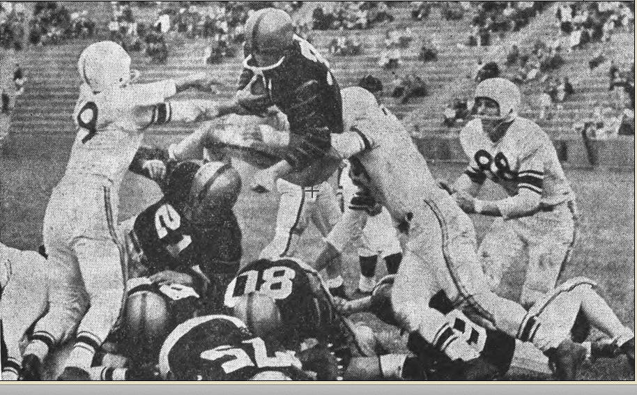
More shots of the '65 Hens. These are all from the '66 Blue Hen yearbook.
There's more from the Delaware hen house: 2011-142004-06, 1997-20031989-921980-881975-791973-7419721967-71.

Monday, April 25, 2016

Cornell Big Red (1966)


The 1966 Cornell helmet is a fun little one-year wonder that probably deserved a longer shelf life. One year after Dartmouth introduced its unconventional striped helmet (still used today) and rode it to an undefeated season and an Ivy League title, Cornell followed suit with its own funky helmet, with two red stripes in almost the exact same position as Dartmouth's four stripes. 

It's easy to say the Big Red was simply trying to copy the Big Green's winning helmet, but take a close look at the photo below:


You can see a small indent in the helmet where the line follows, part of the Big Red's unique externally padded helmet, which was not used by the Big Green. The indent was part of the helmet in 1965 (take a good look at Cornell's helmets and try to ignore the "stacked" defense, which you can read more about here):


and 1967, when a conventional red helmet was used (take a careful look and you can see the indent):


The folks at Helmet Hut can tell you more about Cornell's externally-padded helmet.

The rest of the uniform, with the two sleeve stripes and the two-striped pants, were used for the next decade, and made most famous by Heisman runner-up Ed Marinaro in 1971.


Some shots of the '66 Big Red in action. These are all from the
1967 Cornellian yearbook, which I recently picked up for $2 at a book sale. 

As for the winning ways ... Cornell was 6-3, but only fourth in the Ivy League, which may or may not explain a return to a more traditional helmet the next season.

Cornell on the road in '66. Columbia Spectator pic.

Postscript: In 1977, former Dartmouth mentor Bob Blackman became Cornell's coach, and the Big Red uniform had some Big Green trademarks ... including the funky-striped helmet.

Can't get enough from the Big Red? Check out these uniforms: 2013-141999-200119941985-891983-84, 1977-821967-7519651961-6419521950-51. Rivalry week: Cornell-Penn.

Friday, April 22, 2016

Columbia Lions (1955-56)


For many years, Columbia wore one light blue jersey home and away, even as everyone else was adding white jerseys to better contrast opposing teams. But in the mid-50s, the Lions sported white roads before oddly returning to its single-jersey ways until the mid-60s.

Sid Pinch (not to be confused with Sidd Finch) turns Columbia
and Princeton players into fallen bowling pins in 1955. Daily Princetonian pic.

The 1955 uni is pretty conventional, although the road jersey's pattern bears no resemblance to the home model (a common occurrence then). The '56 design, with the curved numbers, is one of my favorites of the period, and it's too bad the Lions didn't stick with the roads for a few more years (the home shirt was revived in the '60s). It's different, but classy, which is a hard tightrope to walk. The road socks, whose stripes match those on the shirts, are a nice touch, too. Oddly, the Lions didn't appear to wear long socks at home.

The '56 uniform kinda reminds me of the first-year Houston Oilers, with the similar font and light blue motif.

The '56 Columbia home uniform Columbia Spectator pic
-- well, sort of (check the credit line).

The classy '56 roads, from the Daily Princetonian.

Alas, nothing good lasts forever and a million other similar cliches, and Columbia reverted to a more traditional jersey -- without a matching road model -- for '57.

Other Lions unis that'll make you roar: 2015201420132003-051996, 19831974-761971-7319701965-67, 1952-54.


Monday, April 18, 2016

Brown Bears (1951-56)


These Brown uniforms are all very similar, with some small changes in trim and number font from year to year. From at least the late 1940s (when that Paterno guy played at Brown) through 1958, the Bears had a pretty consistent look: White helmets, brown or white jerseys and tan/gold pants. Nothing spectacular, and it wasn't until 1959 that Brown had a really distinctive uniform.

Brown defenders chase a Princeton runner in this
1953 Daily Princetonian image.

Brown (in, er, brown) defends against Rhode Island in 1954 (Grist yearbook).
That caption cracks me up for some reason.

I think know I've said this elsewhere, but I've always found it odd and fascinating that Brown went from gold to silver as a secondary color, especially since none of Brown's other teams (save men's lacrosse) use those color. Anyway, the tan was dumped after the '58 season. I generally prefer the slightly jazzed-up 1957-58 look (see link above).

Brown puts the squeeze on Princeton in 1956.

More unis from the sons of Bruno: 2014, 2012-132004-082001-03, 1997-20001984-891981-831975-77, 1973-741967-711957-58.

Friday, April 15, 2016

Boston University Terriers (1956-57)


Boston University's mid-1950s uniform resembles a stripped-down version what the Boston Patriots might have worn had the Pats existed, only with no helmet logo and no blue trim. It's only fitting, since BU and the Pats shared the same stadium (Nickerson Field, nee Braves Field) in the early '60s. There's also a passing resemblance to the '60s Cornell uni here.

BU was one of the last holdouts (at least among the teams in this project) against white jerseys until a more "modern" uniform arrived in the 1958, complete with sleeve and helmet numbers ... but no shoulder stripes.

Boston University (in dark jerseys) tries to defend Boston College in 1957
in the picture from the '58 BC Sub Turri. There was no Beanpot at stake.

Fifty-six was the last season for longtime coach Aldo "Buff" Donelli, who left for Columbia and later guided the Lions to their only Ivy League title.

One other note, and I bet this has happened to other uni researchers: This post was all set to go, only the 1956 uniform was listed as being from 1956-57. Then I plopped in the BC-BU photo and ... aw shucks, there's a STRIPE on the helmet? How'd I miss that? Five minutes later, a new 1957 graphic was created, and the original 1956-57 image was in the poop chute. This has happened to me a few times, and probably will again.


The team is gone, but the memories remain. More BU unis: 19971990-921988-891984-871968-70, 1965-671963-64.


Monday, April 11, 2016

Boston College Eagles (1995-96)


The 1990s Boston College uniform represents a transition between the Flutie-era look and the modern uniform: It has the Champion-style numbers from the 1980s, but the darker red and, er, golder gold from the modern uniform. It's not the most remarkable uniform, but it's instantly recognizable as a BC uniform, and that's not a bad thing.

If you look reeeeeeeealy closely, you'll see a teeny-tiny Big East logo at the bottom of the V-neck on each jersey. I kinda miss the days before every jersey had to loudly boast its conference on the front, usually as an excuse to add patches to a jersey already weighed down with word marks, sleeve logos and manufacturers logos. Sometimes, less is more, and this uniform bears that out.

UPDATE (January 2022): In '95, BC also wore a patch for the Kickoff Classic game against Ohio State at Giants Stadium. The Eagles fell to '95 Heisman Trophy winner Eddie George and the Buckeyes, 38-6.

The 1996 Boston College home uniform ...

... and its road counterpart.

Craving some more BC unis? Look right here: 201420132007199419841982, 1978-801968-771958-60, 19571955-561950-521939Rivalry Week (w/Holy Cross).


Monday, April 4, 2016

Middlebury Panthers (1978)


It's been a while. Vacation is over; it's time to hit the uniforms again.

We'll look at one last Division III uniform before returning to the D-I ranks later this week. Vermont's Middlebury College -- best known as the alma mater of Seattle Seahawks kicker Stephen Hauschka -- has worn Michigan/Delaware-style helmets since 1979, which means the Panthers could wear burlap sacks for shirts and pants and still have awesome uniforms. Well, here's what Middlebury wore in 1978, the last year before switching to the iconic helmet.

The Middlebury uniform fem 1978, the last season before the wings helmets debuted.
 The photo is from the Middlebury Campus newspaper archive.

The jerseys strongly resemble Maine's from the period, while the helmets and pants are plain silver with a blue stripe, which the Panthers retained for a while after the helmet change.

The winged helmet was introduced by head coach Mickey Heinecken, who previously played and coached at -- of course -- Delaware.