Thursday, July 30, 2015

Rhode Island Rams (1967-71)

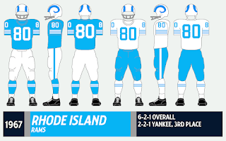
After wearing navy the last several years, Rhode Island took its 1966 uniform, kept the basic template and changed the shade of blue. As (I think) I've said before, when you think of Rhody, you think of light blue, and any other colors should be kept to a minimum.

This is one my favorite late 60s-early 70s styles. I like the notches in the rams' horns on the helmet, I like the number font -- which deviates from the "Champion" font of slanted 2s and curved 7s so common then -- I like the striped socks and I even like the light blue pants, which are a little lighter than what Columbia, Rhody's Ivy League doppelgänger, was wearing at the time


The 1969 Grist yearbook has some pretty amazing shots of the Rhody
football team. If the folks at cfbdatawarehouse are correct, these pix are from
Oct. 12, 1968, a 52-10 win over Vermont.


Two more shots against UVM, and ... hey! That's an undocumented style
the Catamounts are wearing! I'll add that to the file soon.

Some slight modifications were made in the 1970s (the elimination of sleeve numbers and blue pants and the addition of "Champion" numbers), which we'll get into at another time.


The '69 Rams in action against Temple.
Yes, Rhody once hosted Temple in football.
The Owls were roughly a Yankee Conference-level team then. 
There are more uniforms out there from Rhody: 201420131997-991983-921976-8219661957-611936-39. Rivalry Week: UConn-Rhody.


I've never seen a ram so happy to be wearing ...
whatever it is he's wearing.

Monday, July 27, 2015

Vermont Catamounts (1962-63)


As this blog nears its first anniversary, I should note that the 1970-74 Vermont post is by far the most popular post, which I guess makes Catamount football the Brooklyn Dodgers or Hartford Whalers of New England college football. Time for another trip to Catamount Country!

The big difference between the 1962-63 uniform and the 1964-66 edition is the use of shoulder stripes instead of the "V" on the sleeves. I've never been crazy about uniforms that use three different colors for the helmet, shirt and pants, but this is one of the better examples of that genre.


I love these old-school poses. They're cheesier than a plate of nachos,
but they're also just plain fun and make me want to grab some old AFL football cards.
The top pictures are from 1962, the bottom for '63. All are from the Ariel yearbook.


The Catamounts in action in 1962 (top) and '63 (bottom).
Those Middlebury uniforms -- and that scoreboard -- are quite funky.

Want more uniforms from the ol' 802? Of course you do? 1964-67, 1968-69, 1970-74.

Thursday, July 23, 2015

Cornell Big Red (1983-84)


Even though Cornell's uniforms under coach Bob Blackman were the most distinctive in the Ivy League, the Big Red underwent no dramatic overhaul after Blackman's departure in 1983. Instead, Cornell changed its look verrrry gradually, piece by piece, throughout the rest of the decade under coach Maxie Baughan. 

First to go: The helmets with the quasi-Dartmouth striping and the "CORNELL" across the sides. In their place was a plain red helmet with a block "C." The helmets have undergone minor changes since, but the block "C" remains to this day.


Sadly, I don't own this jersey, but I found these pictures
on eBay a while back. Remember when 1980s jerseys were
all cut off at the bottom? Better for linemen to show off their beer guts.

In '85, the curved numbers went bye-bye, player names were added in '86 and the big-ass "CORNELL" across the front was ditched in '90, along with the striped socks. 


Cornell battles Dartmouth in 1983. This pic is
from the cover of the '84 Dartmouth media guide.

Can get enough from the Big Red? Check out these uniforms: 2013-141999-200119941977-821967-751965, 1961-64. Rivalry week: Cornell-Penn.

Monday, July 20, 2015

Penn Quakers (1983-84)


This is basically a slight continuation of Penn's early-80s unis, first mentioned here. In 1983, the Quakers added a blue outline to the red numbers on the road jerseys.  


Penn takes on Columbia (above) and Princeton (top) in 1984.
I really need to post those Columbia unis one of these days.

Call me crazy, and I know they're dated by modern standards, but damn, I miss stripes on sleeves and socks.

Penn, showing its 1982 Ivy League title was no fluke, won the Ancient Eight again in '83 and '84.

More Penn uniforms, old and new, red and blue: 201420131992-941981-821971-78, 1965-661956-641948. Rivalry Week: Cornell-Penn.


Friday, July 17, 2015

Columbia Lions (1974-76)


After years of instability, Columbia's uniforms found one design and stuck with it for a few years in the mid-1970s.  The jerseys, which used to have more stripes than they knew what to do with, were gone, and a cleaner look took over. There were no alternate jerseys. White shoes took over, making the Lions one of the first teams in this project to go the Joe Willie route with footwear. 


Columbia mucks it up with Lafayette in 1974.
The Lions try to stop a Yale runner in '74.
Both pix are from the Columbia Spectator archives, of course.

The uniforms didn't change much for the rest of the decade, except for one year (1977) when the Detroit Lions-style logo was missing from the helmets.

Looking to roar some more? Check out these Columbia uniforms: 201420132003-519961971-731970, 1965-67.


It won't be too long before the cheerleaders parade the sidelines again.


Monday, July 13, 2015

Yale Bulldogs (1959-60)


Every Yale post I've made so far has the big ol' "Y" on the helmets. Let's change that!

Like virtually every other team in the 1950s-60s, the Bulldogs had numbers on the helmets. Block numbers were the order of the day before curved numbers took over from 1961-63 and again in '65.

A Yale-Brown program from 1959.
That is one strange picture, probably because the ball is spotted
in front of a wall. Despite what the picture says, Yale wore
numbers on the helmets in game action.

A neat Yale Daily News photo spread from a 1959 Yale-UConn game.
UCon n?

The jersey trim is rather confusing. It appears both white and gray trim was used, although that could just be poor reproduction from old black and white photos. I've included both to play it safe.

Another Yale Daily News photo, this from 1960.
Yale beat Harvard 39-6 to wrap up a 9-0 season.

Want more from the sons of old Eli? Look here: 201420131997-981994, 199619781974-77,  1967-68, 1965. Rivalry Week: Harvard-Yale.

Thursday, July 9, 2015

Northeastern Huskies (1963-68)


During its 67-year-existence on the gridiron, Northeastern could never settle on a home jersey color. Some years, the Huskies wore black shirts; in others, they did battle in red. Well, in the 1960s the answer was "none of the above," as they exclusively wore white home and road. 

It sounds simple, but the Huskies often wore more than one jersey style, plus they made subtle changes on a year-to-year basis. Stripes on the shoulders one year, on the sleeves another, forget stripes; how about numbers? And what color should those numbers be?

Northeastern takes on UNH at home in 1963.
Those houses in the background tell you it's definitely Parsons Field.
Northeastern's other white jersey in '63 had shoulders on the sleeves.
Notice the shorter sleeves; perhaps this was a warm-weather shirt?
I think the Cauldron ran this pic three straight years.

What made this a challenge to research was the tendency of the school yearbook (the Cauldron) to recycle photos in the mid-60s. Some photos ran two or even three straight years. Perhaps the folks at the Cauldron figured no one would know the difference?

Nineteen sixty-eight was a transitional year for Northeastern; it was the last year of white-at-home, but it was the first year of the awesome "NU" helmet logo, which was used for the next 10 years.

More from '63.

Northeastern facing Colby (I think) in '64.
By this time, numbers were on the helmets.

Crave some Husky leftovers? Some more Northeastern uniforms: 2008-091989-90, 1982-86, 1976-77.

Monday, July 6, 2015

Brown Bears (2001-03)


Previously, we looked at Brown's uniforms from the late 1990s, and the near mirror-image unis they wore in the aughties after a three-year absence. Well, this is what the Bears wore in the interim. 

This was always a favorite of mine (well, maybe not the all-brown version) and I was sad to see it go. It's simple, uncluttered and classy (well, maybe not the all-brown version). The paw looked nice on the helmets, while the logo used before and after looked dark and mushy from a distance. (The current logo does rule, however.)

The other uniform used brown, white, red and silver, while this one stuck with good ol' brown and white. Nothing to complain about.

Well, except maybe the all-brown version. 

A collection of Brown skeds.

How about some more Brown unis? 2014, 2012-13, 2004-081997-20001984-891975-771967-71.


Thursday, July 2, 2015

Boston College Eagles (1958-60)


Starting in the late 1950s and continuing well into the 1970s, college football teams here, there and everywhere slapped numbers on their helmets. Every single school in this project that fielded a team in that era (except for one: can you name it? Answer below) wore numbers on the helmets at one time or another.

The Boston College Eagles were no exception, although they strangely punted on the numbers in '59 before they brought them back in '60. In '61, they were gone again, not to return until the 2012 Wounded Warrior Project uni. (I really need to get that on here some time.)

What is that on the BC helmet? Eagles and fans celebrate
a win over Holy Cross in 1958.

The numbers mysteriously vanish in 1959 against Dartmouth.
This is either from The Heights newspaper or the Dartmouth archives, I forget which.
Everything else is from the Sub Turri. 

Check out the rest of the uniform -- at first glance, it resembles USC with gold helmets. (Don't get any ideas, Trojans; your unis are great as they are.)


The numbers return for '60.

Craving some more BC unis? Look right here: 2014201320071994198419821968-771955-561950-521939Rivalry Week (w/Holy Cross).

And what team never wore numbers on the helmets? Delaware -- of course.