Monday, May 22, 2017

Boston University Terriers (1958-62)


The Boston University uniform was a model of consistency from the late-1940s until 1965: white helmets, red jerseys, white pants, and that was about it. In 1958, the Terriers let their hair down and added white jerseys, helmet numbers and sleeve numbers. 

Boston University (in dark jerseys) chases down a Holy Cross ballcarrier in 1958
in a photo from The Crusader newspaper.
The 1960 Terriers. Notice how some sleeves are cut short, others
are all the way down to the wrists and others are in between.

In 1961, BU made a couple deviations from the tried and true: The helmet numbers moved to the front AND back (sorta-kinda like the New York Giants of yore) and added the school seal on the sides of many (but not all) helmets for the Boston College game, a 10-7 Eagles win.

In '62 the helmet numbers returned to the sides, and a second helmet stripe was added.

A "high flying Terrier" sports the school shield on the helmet
in a 1961 game against Boston College. Photo from the Sub Turri yearbook.

What's might be more interesting than BU's uniforms or the team (no winning record from 1958-64) is the stadium: Nickerson Field, which rose from (some of the) ashes of Braves Field after the baseball team bolted for Milwaukee in 1953. You can read more about the conversion here. Who knew Nickerson Field was named for a guy who helped in the development of the Gillette safety razor? 

The ghosts of old Braves Field is noticeable in the accompanying pictures -- you can even see the outline of the old baseball diamond, which makes me wonder if the BU baseball team played there. (Another shot can be found toward the end of this article. Photos of the 1950s renovation can be found here.)

Boston University/Nickerson Field in 1957.
Note the faint outline of the baseball diamond.

1959. The main grandstand later was torn down and replaced by dorms,
and the field was moved to face the right field stands, from where
this photo was taken. Both pics are from BU's Hub yearbook.

The team is gone, but the memories remain. More BU unis: 19971990-921988-891984-871968-701965-671963-641956-57.

Sunday, May 7, 2017

Boston College Eagles (1989-90)


The Boston College uniform from 1989-90 -- the last two seasons under Jack Bicknell's tenure as coach -- is a bit of a transitional look between the Flutie-era glory days and the Tom Coughlin-era return to glory of the early-mid 90s. This uniform was worn by the sad-sack Eagles who came in between.

The sleeve numbers are bumped up to the shoulders, where they remained until the late 90s, and the stripes are replaced with the interlocking "BC" logo -- minus the eagle that usually graced the front of the logo. The mustard yellow pants from the Flutie era remained. 

A nice shot of the Boston College 1989-90 sleeve logo.
All these pics are from the Sub Turri yearbooks.
Continuing the theme of this being a transition period,
here's freshman QB Glenn Foley in 1990.
He later led BC to its famous 1993 upset of Notre Dame
and finished fifth in the '93 Heisman Trophy balloting.
And to think I always thought he was a Tom Coughlin recruit.
After Flutie's departure following the 1984 season, the program fell into a bit of a tailspin, achieving only one winning season from 1985-90. The Eagles went 2-9 and 4-7 in the transitional uniform and Bicknell was fired as coach. "I just don't look at it like it's a business," Bicknell said after his firing, according to Boston College Football Vault. "I look at it like it's a sport."

The road version of the 1989-90 uniform.
Bicknell was done at BC, but he was far from done as a coach. He coached in the World League of American Football/NFL Europe for 14 of league's 15 years, going 71-74-1 with three teams (Barcelona Dragons, Scottish Claymores and Hamburg Sea Devils). He won the 1997 World Bowl with Barcelona behind future NFL quarterback Jon Kitna.

And if you think some the uniforms on this blog are unusual, you should check out the duds Bicknell's Dragons wore. And duds they were ...

Craving some more BC unis? Look right here: 2016201520142013200720001995-961994198419821978-801968-771958-60, 19571955-561950-521939Rivalry Week (w/Holy Cross).

Remember those old "This is your brain on drugs" ads from the 1980s?
Well, Miami had its share of scandals then, and BC fans
were more than happy to rub it in. "Catholics vs. Convicts," of course,
was a label made more famous by the Notre Dame-Miami rivalry of the late 80s,
and is the subject of one of about a thousand "30 for 30" documentaries on Miami football.

Thursday, April 13, 2017

Penn Quakers (1935-38)


Ivy League football teams practically drown themselves in tradition -- well, until they all started wearing black alternate uniforms the last few years -- and the Penn Quakers are no exception. I mean, check out those red-and-navy striped sleeves, which have been around since the 19th century -- and modern football jerseys don't even have true sleeves anymore!

The trademark sleeves were a part of Penn's 1930s jerseys, which came in three colors. The blue was primarily worn unless the Quakers played another team with blue jerseys; that's when the dark reds were broken out, as was the case for a home game against Michigan. (Remember, many teams wore only one jersey home and road, and wore an alternate-colored jersey only when they absolutely had to.)

Penn, in the dark jerseys, takes on Columbia in 1937.
Check out that awesome scoreboard clock in the background.

George Munger became coach in 1938, and he brought new jerseys with him. The blues were ditched for a white model worn both home and road, which made the Quakers one of the very few teams to regularly wear white at home. To the best of my knowledge, Penn didn't wear dark jerseys again until 1956, three years after Munger's last season.

Check out the photos below of Munger and captain Walter Shinn, who led a pretty interesting life that included a stint in minor league baseball and distinguished service in World War II as a Navy pilot. You can read more about him here.

Now this is cool. In the top photo, new Penn coach George Munger is telling captain
Walter Shinn the old jerseys are going bye-bye. (Check out the caption below on the
back of the photo, which I got from an eBay listing).
The shot of Franklin Field in the background rules, too.


Another photo of Munger and Shinn from '38. In this pic, Shinn is
wearing the red jersey (which I don't believe was worn in a game that year,
and this pic appears to be from a press function) while  holding a very
un-Penn-like helmet. Hmmmm ...

On an other note, the 1936 Quakers went 7-1 and finished 10th in the final Associated Press rankings. Three of the wins came against Michigan, Penn State and Navy. I know I've said things like this before, but ... can you imagine an Ivy football team doing that now? 

More Penn unis: 2015-16201420131995-99, 1992-941983-841981-821979-801971-781965-661956-641954-551948. Rivalry Week: Cornell-Penn.

Readers, I think we may have found our first-ever throwback game.
In this 1936 photo, a group of Penn students are wearing 1876-style uniforms
in honor of the Quakers' first season of football. According to the caption below,
they were to "play" a group of Penn students in Princeton
19th-century garb at halftime of a game that season. These guys also get bonus points for
sporting mutton chops that would put Walter Camp's to shame. Almost.


Thursday, March 30, 2017

Maine Black Bears (1939-46)


This one's a bit of a head-scratcher.

In 1939, Maine introduced a monochrome uniform with white helmets, a look it retained through 1946 (the Black Bears played a minimal schedule during the war years). The jersey and pants were both navy blue ... or were they? Check out this column from the Oct. 7, 1940 Columbia Spectator following the Maine-Columbia game in New York, and I'm not talking about the Wendell Willkie references, either:


Whoa-whoa-whoa ... black uniforms? By a team that's always worn blue? 

The column ends with another reference:


Somehow, I don't think Maine wore black unis, but without color photos or references to black uniforms elsewhere, we'll never know for sure. But I've seen enough black-and-white photos to know that Maine's unis were a few shades darker than what they wore before and after. For now, we'll go with a midnight blue that could easily pass for black from a distance. Hey, the old Prism yearbooks always made references to the "Pale Blue Gridsters" even when they weren't wearing pale blue.

Really, it's little curveballs like this one that make uniform research so much fun.

This rather sobering photo comes from Stuart Haskell's exhaustive, definitive and fascinating tome,
The Maine Book. So many football players from this era went overseas and never came back.
A tip of the helmet to you all.

What can't be questioned is that Maine debuted white jerseys in 1940. From the indispensable University of Maine: A Sports History (1992):
In 1940, Maine wore white game jerseys for the first time ever in a game against Colby. It was an attempt to break a jinx -- Maine had lost four straight games in the fourth period and three of the four winning teams had worn white jerseys. ... It didn't work -- Colby won, 20-0.
Shut out by Colby? Ugh. 

Maine debuts the white jerseys against Colby, 1940.
Every time I see old Colby photos, the Dutch Clark- or Doak Walker-era
Detroit Lions come to mind. This picture is from Colby's Oracle yearbook.

Another oddity of this uniform: The big white waistband that contrasts the rest of the outfit. I don't think I've seen that anywhere else.

Because of World War II, Maine endured numerous coaching and personnel changes, but the uniforms stuck around (I skipped 1943, because I have no photos of the one game Maine played that year), probably because money was needed for more important things than football uniforms ... whether they were black, blue or white.

Ed Barrows (27) was one of those Black Bears who died in World War II.
His father, Lewis Barrows, was the governor of Maine from 1937-41.
The State Series trophy, which was awarded to Maine's top team every year,
was dedicated in the younger Barrows' honor.

A close-up of the white jersey, 1942.
These two pictures and the one below are from the Prism yearbook.

Can't bear to be without Black Bear uniforms? Here are some more: 2016201520142011-131997-9919851976-84197519741965more 1965, 1963-641957-591949-501928-29. Rivalry week: Maine-New Hampshire. Inside the jersey: 2010-13.

From 1939. Now THIS is what someone should do for a schedule poster!
Who needs those fancy-schmancy graphics, anyway?

Monday, March 13, 2017

Vermont Catamounts (1958-61)


Well, everyone in the Green Mountain State is abuzz over the Vermont men's basketball team laying everyone in its waste en route to an NCAA Tournament berth, so it's natural we talk about UVM football, right? ... All right, maybe not, but work with me here.

After many years of plain gold (yellow) helmets, the Catamounts shook things up by switching to green lids, with those oh-so-trendy numbers on the side. The green helmets were  eventually replaced by white ones, which were replaced by yellow ones, which were replaced by green ones again (see links below).

Vermont football in action at Centennial Field, 1961.
You may have heard Vermont's pretty in the fall.
These pix are all from the Ariel yearbook.

A nice close-up of the home jersey, 1959.

The most interesting aspect of the uniform is the socks: A yellow base with green tops and a strip of white in between. For the home unis, that's the only white on the entire getup. By '61 the socks appear to have vanished in favor of the traditional white stubs. 

Flying through the air with the greatest of ease ...
Check out the socks with the gold base on No. 22.

Senior gridders show off their road duds, 1961.
The roads have a completely different pattern from the homes.

One oddity about the team that has nothing to do with the uniforms: Although UVM was a member of the Yankee Conference, the Catamounts played nothing resembling a full conference schedule during this time period, with only five conference games (all losses) TOTAL over this uniform's life span. In fact, only Maine and Rhode Island played a full five-game league slate at any time before 1962, and full round-robin play wasn't instituted until 1966. You would think a small bus league like the YC would have no problem constructing a full league slate, but I guess Vermont was content to play the Middleburys and Rochesters of the world.

Want more uniforms from the ol' 802? Of course you do! 1940-42, 1946-481962-631964-671968-691970-74.

This photo, from an eBay listing, shows a Vermont player
holding the ball for Miss Vermont, 1961. I imagine when you're Miss Vermont,
you can have your pick of football players.

Thursday, March 9, 2017

Brown Bears (1959-65)


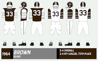
Somehow, I've gone more than 2 1/2 years without talking about this classic uniform.  Brown's 1959-65 uniform has a decidedly Princeton look and feel to it*, although I believe the Bears wore something similar decades earlier (confession: outside the three NEC teams, I probably have less info on Brown than any other team in this project, at least pre-1950). Brown shirt, white sleeves and brown stripes at home; a perfect mirror image on the road. In 1962, a number was added to the helmet, putting a nice cherry on the top.

A couple Daily Princetonian shots from 1961 of Brown's uniform,
against the team that (possibly) inspired it.

I posted this bizarre picture before with my 1959-60 Yale post,
but I just have to repeat it here for Brown. Although
the player in the photo is wearing the 1958 helmet,
those lids were never worn with the 1959 uni.
The team, alas, was a dud in these duds, as the Bears went 17-51-3 under coach John McLaughry (son of Tuss McLaughry, the great Brown coach and OK Dartmouth coach) from 1959-66. The Ivy League of the era consisted of the haves (Dartmouth, Harvard, Yale, Princeton) and the have-nots (Cornell, Brown, Columbia and Penn), and the Bears mustered just one winning record while wearing these unis.

Brown against Princeton again, this time from 1964.

Brown tangles with Rhode Island in 1964.
Note the addition of the number on the helmet. 

More unis from the sons of Bruno: 201620152014, 2012-132004-082001-03, 1997-20001984-891981-8319781975-771973-7419721967-711957-581951-56.

* Somehow, I've also gone this long without discussing the classic Princeton uniform much, other than in the Rivalry Week post with Dartmouth. It's what happens when you spend too much time hunting down the obscurities.


Monday, February 27, 2017

Harvard Crimson (1937-46)


Back in the leatherhead days -- and even in the early plastic era -- football helmets were constructed with stock designs that made for some interesting possibilities when it came to painting pretty patterns (you can see examples here, here and here). 

Harvard was no stranger to the party, as you can see here. But the Crimson's 1930s-40s helmet is an odd one, indeed. The helmet was crimson, except for the back panels, which were left white, giving the whole thing an unfinished appearance. I have no idea why it was like this, and I've never seen anything like it anywhere else. But then, I knew a guy in high school who had a bowl haircut in the front, and a shaved head in the back. Maybe one of his ancestors designed this helmet?

The Harvard uniform, circa 1947. The helmet's missing something in the back.

Harvard in action against Penn -- which had its own unique helmet pattern -- in 1942.

Judging by photos from the Harvard yearbooks (called the Class Album at the time, but with Harvard yearbooks, you can never really tell what they're called) the helmets were closer to a true red than crimson.

The rest of the uniform has the familiar crimson jersey and tan pants, with Red Sox-style numbers of varying sizes that were used through the end of the decade.

This photo, from some time in the 1940s, provides a good look
at the Harvard helmet's pattern, not to mention one of those
cool homemade facemarks. 

Other Harvard unis you may have missed: 201620152012-142008-111980-831975-79; 1972-73; 19721967-701962-631950-521948-49. Rivalry Week: Harvard-Yale.