Tuesday, November 27, 2018

Brown (2018), Columbia (2018), Cornell (2018)

Time to get some of these 2018 uniforms out of the way, starting with a trio of Ivy League schools. I'll bypass teams that are still playing (Boston College, Maine) for now, and will likely save the NEC guys for the end.


Brown (1-9 overall, 0-7 Ivy, second straight winless Ivy season) crashed and burned in Phil Estes' final season as coach. The Bears kept the same uniforms as last year, with the exception of the "JM" patch, which was removed. 

More unis from the sons of Bruno: 2017201620152014, 2012-132004-082001-03, 1997-20001984-891981-8319781975-771973-7419721967-711959-651957-581951-561914.

Columbia (6-4 overall, 3-4 Ivy) achieved back-to-back winning seasons for the first time since 1961-62. As I mentioned last year, Al Bagnoli can, indeed, raise the dead. Considering how ashamed the New York Times was at Columbia's turnaround last year, those folks must be foaming at the mouth now. 

But back to the uniforms. The Lions wore four different jerseys this season ... and none of them were Columbia blue -- which is, y'know, only their primary color. In addition to navy, black and white tops, a gray jersey was added to mix this year. The numbers, oddly enough, were done in a traditional font while everything else was rendered in the style of the other three jerseys. For the third straight season, the Bill Campbell No. 67 memorial patch from 2016 was worn, even on the new gray shirts.

Other Lions unis that'll make you roar: 20172015-16201420132003-051996198419831978-82, 1974-761971-7319701965-6719611955-561952-541941-45.


Cornell (3-7 overall, 2-5 Ivy) is our first recipient of a KISS (Keep It Simple, Stupid) Award for using only two styles -- home and road, with no alternates, no mixing and matching, nothing else. The red pants from 2017 were ditched after one season, and a new set of white pants debuted, without the "CORNELL" up the side. The home and road jerseys from last year remained. The roads STILL have that NCAA/Ivy League patch that everyone else ditched at about the turn of the decade. A few more years, and it'll qualify as a throwback jersey. 

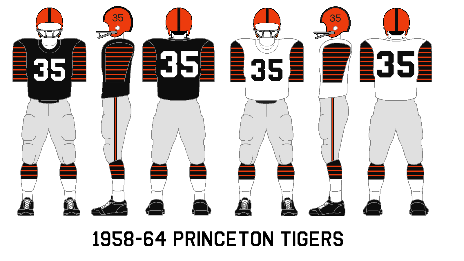
Can't get enough from the Big Red? Check out these uniforms: 2017201620152013-141999-200119941985-8919871983-84, 1977-821967-75,  196619651961-6419521950-51., 1931-35. Rivalry week: Cornell-Penn.


Monday, November 12, 2018

Princeton Tigers (1958-69)


As of this writing, the Princeton Tigers are but one win away from their third Ivy League title in three years, and their first undefeated season since 1964. The uniforms above were the "classic" Princeton uniform of that era, as it went virtually unchanged for a dozen years, with only some tiny trim alterations here and there (check the socks and pant stripes verrrry closely). Ah, for the days of sleeves and stripes. I think I've mentioned this before, but I like how Princeton and Nike in recent years have done their best to preserve the fabled tiger stripes on the jerseys, even though sleeves are a thing of the past.

The home uniform in 1958, from the Princeton Bric-a-Brace yearbook
(the second coolest yearbook name, behind only Virginia's Corks and Curls).

The 1960 road uni, also from the Bric-a-Brac.

The '60 home uniform, in a nice candid shot. 

The 1960s were a hot period for the program, which was no easy task considering Bob Blackman's Dartmouth Big Green was running roughshod over the rest of the Ivies. The Tigers won or shared four Ivy crowns in the decade, while Dartmouth won five (and a sixth in 1970). Coach Dick Colman used the single-wing formation to great success, although it had gone the way of leather helmets everywhere else.

The star of the undefeated '64 team was the wonderfully named Cosmo Iacavazzi, who was a third-team All-Ameircan and subject of one of the worst airbrush jobs ever. In this post, I mentioned how the folks at Topps in 1965 half-assed their attempts to turn Boston College end Jim Whalen's uniform into a Boston Patriots uni. Well, Topps did the same thing that year to poor Cosmo, who signed a contract with the New York Jets during the 1964-65 offseason. Iacavazzi's black-and-orange Princeton top was given a green-and-white makeover, making him look more like a Saskatchewan Roughrider.

Cosmo Iacavazzi, of YOUR Princeton Jets. Or New York Tigers?

Here's Cosmo (far left) during his brief Jets career, taking a handoff
from another rookie, quarterback Joe Namath, in a 1965 preseason game against
the Patriots in Lowell, Mass.
You can read a little bit about the '64 team here.

A fine article here discusses the '66 team and the hardships it overcame to win a share of the Ivy crown that year. 

In 1969, with a new coach (Jake McCandless) and a new playbook (the T-formation finally arrived), Princeton celebrated the centennial of college football by wearing a small "100" decal on its helmets, The Tigers, of course, played in the first recognized college football game in 1869 against Rutgers and lost, 6-4 (no, don't expect any uniforms from that game to appear here.) The teams faced off again in '69 and the Scarlet Knights again prevailed, 29-0. (With Rutgers now in the Bee-One-Gee, one shudders what would happen if they faced off in a 150th anniversary game next year. Princeton went on to win part of another Ivy title when it thumped Dartmouth 35-7 in the season finale, denying the Big Green an undisputed championship ... and an undefeated season.

Princeton didn't win another Ivy title for 20 long years.

Dartmouth and Princeton share pleasantries before their 1969 game,
when Princeton won a share of the Ivy League title. Yes, football players
were much smaller then.
This photo collection from an eBay listing shows off the
1969 Rutgers-Princeton football centennial game.
More unis from Old Nassau: 2017201620152014201319961993-95, 1994, 1987-901984-861975-771979-831970-721956-571955, 1949-541947-481945-46. Rivalry week: Dartmouth-Princeton.

Feed the kitties or they'll do this to you.


Monday, October 1, 2018

Holy Cross Crusaders (1999-2002)


Yup, I know it's been a while. Let's try to fix that.


As I think I've pointed out a few times, the 1990s are almost bereft of nostalgia. The '50s through the '80s have all had their nostalgia waves, but for some reason the '90s/early '00s was passed over like a day-old half-off danish. As someone whose high school AND college years were in the 90s, I know from whence I speak. All my Facebook friends from that decade moved on and had kids -- trust me, no one's reminiscing about the Sega Genesis or the Spin Doctors. 

Maybe it's because the football uniforms didn't age well. Take the duds Holy Cross wore at the tail end of this forgotten decade. I'm not as anti-purple as some of the interwebs, but there's far less margin for error than with other colors. Let's count the errors of this one: Drop-shadow numbers? Check. Weird sleeve/neck pattern? Check. Heavily detailed, hard-to-see logo (for '99)? Check. It adds up to a less-than-memorable design. The helmet inconsistency doesn't help, either, with numbered helmets (previously an HC staple) returning in 2000-01, followed by blank lids in '02.

The 2000 Holy Cross media guide shows off the 1999 uniform in all its garish glory.

The 2001 media guide is designed to resemble a webpage,
back when the internet was still a new-fangled world.
The 2002 media guide shows off the road uniform.

In all fairness, the current design is one of the best the Cross has ever churned out, especially the "HC" helmet logo, and will certainly age well 20 years from now ... unlike what they had nearly 20 years ago. Purple can work; it just takes a little more, er, work to make it work.

For more pictures than you could possibly hope for, the folks at Gameface have 'em for  you right herehere and here.

Want more from Holy Cross? Look here: 201720162015201420132004-0819921986-91,  1981-85, 1976-801973-74197219711967-701963-651956-591951-55. Rivalry Week: Boston College-Holy Cross.


Sunday, April 8, 2018

Boston College Eagles (1962-63)


In this day and age, it's common for sports teams to find the flimsiest excuse to wear a commemorative patch. It seems many teams will slap on a patch whenever it reaches an anniversary ending in "1" or "5." (The worst examples: The Chicago White Sox wearing a 95th anniversary patch in 1995 and the Bruins wearing a 90th anniversary patch in 2013-14.)

But in the olden times, teams wore patches only when they REALLY meant it. Take Boston College. In 1963, the Eagles celebrated the school's 100th anniversary with a patch on its football uniforms in 1962 AND '63. While the player's left sleeve bears a uniform number, the right sleeve bore the school's seal. If you look closely in the photos below, you can see some words in an arc above the seal, presumably to note the school's milestone.

The Boston College seal.


The '62 BC Eagles in action. Note the patch on the right sleeve.

While we think of BC's colors as maroon and gold (selected by the Jesuit school because of their connection to the papacy), those traditional shades only appear in certain places -- the helmets and the numbers/trim on the road jerseys. Everything else is rendered in something closer to red and yellow. Throw in the shoulder stripes, and it's easy to mistake these unis for USC. 

BC and Holy Cross face off at Alumni Stadium in 1962. The stadium
was roughly two-thirds the size it is now. Note the red and yellow
in the Eagles' uniforms.
The team itself was pretty good, racking up a combined 14-5 record under coach Jim Miller. In '62 quarterback Jack Concannon thew 15 touchdown passes, which in those days, when passing was considered a mortal sin in some corners, was tied for the national lead. That wouldn't lead the nation after the first month in the 2010s. 

(BTW, check out the schedules from this era. Before Joe Yukica came in '68 and gradually brought BC back to the big time, the Eagles were playing schools such as Detroit Mercy, Wichita State, VMI, Villanova and Boston U. -- not exactly the SEC we're talking about, which is probably why BC didn't receive any bowl bids.)

The '63 Eagles huddle up and listen to quarterback Jack Concannon (3).

In '64, the jersey number returned to the right sleeve, only for an eagle logo to replace it in '66, ending BC's brief jersey symmetry. 

One fun postscript: When Topps made football cards in the 1950s and '60s, the bubble gum lords didn't always have the most up-to-date photos handy, and sometimes had to resort to desperation in order to obtain a certain photo of a player. On top of that, Topps colts be just plain lazy. (If you don't believe me, check this out. Topps used the same poorly colored Joe Kapp photo no fewer than SIX times over the years between its CFL and NFL issues.)

This perfect storm gathered in 1965, when the Boston Patriots drafted tight end Jim Whalen out of Boston College. Topps, which back then usually waited a year to put newcomers into its sets, elected to issue a Whalen card during his rookie year (as it did with a few other '65 rookies, including some guy named Joe Namath). With no photo of Whalen in a Pats uniform handy, Topps did the next best thing and performed a paint job on a black-and-white photo of Whalen in a BC uniform. How can you tell? Check out the centennial patch on the sleeve! At least the Eagles and Patriots used a similar jersey template, particularly with the  shoulder stripes. 

Jim Whalen, in all his airbrushed glory.

This airbrushing might have been more convincing if Topps hadn't chosen to give Whalen a silver helmet and pants and light blue shoulder stripes. Instead of looking like an Eagle or Patriot, he resembles, well, no team ever.

And to add insult to insult, Topps used the same photo in 1966 AND '67, not bothering to find an updated photo of Whalen in red, white and blue. 1960s Pats fans who found the recycled Whalen photo in their packs were probably ready to throw their bubble gum and funny rings against the wall. (If you peruse the Vintage Football Card Gallery, you'll see that even Pats stars such as Gino Cappelletti weren't immune to photo recycling.)


Jim Whalen's 1966 (top) and '67 Topps cards.
Say, these look familiar. ...
Craving some more BC unis? Look right here: 20172016201520142013200720001995-9619941989-90198419821978-801968-771958-60, 19571955-561950-5219391935-38, Rivalry Week (w/Holy Cross).


Thursday, January 18, 2018

Boston College (2017), UMass (2017), Yale (2017), New Hampshire (2017)

OK, it's been a while, so let's wrap up our review of 2017 uniforms. Because of other projects, my posts are likely going to be less frequent, at least until next season. But I still plan on posting little goodies to the Facebook page, and, well, there are plenty of archives to pore through here. So awayyyyy we go ...


Boston College (7-6 overall, 4-4 ACC, lost to Iowa in the Pinstripe Bowl) put names on the back of its jerseys for the first time since 2012; otherwise, everything stayed the same, right down to the bandana-man tribute alternate. 

Craving some more BC unis? Look right here: 2016201520142013200720001995-9619941989-90198419821978-801968-771958-60, 19571955-561950-521939, 1935-38, Rivalry Week (w/Holy Cross).


UMass (4-8 in the cold, lonely world of the independents) added a couple of trick plays to its ensemble: A kick-arse 1972 throwback helmet to honor that season's Boardwalk Bowl team (discussed here), and an all-black Veteran's Day uniform worn at the Fenway Park game against Maine. (I was at the game, and good God, the fans were as drunk and uncouth as the weather was cold. I was walking back to my seat with a spiked hot chocolate and one drunken loudmouth yelled at me, "Hey, how do you like your overpriced COLD chocolate?" And he was a Maine fan!) The black jerseys all had "MINUTEMEN" on the back in lieu of names. I thought the black uniforms died with the Charley Molnar administration, but oh well. ...

Much, much more from UMass: 20162015201420132000-021986-871978-841975-771974197319721966-681960-621953-541951-521938-39, 1930. Tribute: Dick McPherson.


UNH (9-5 overall, 5-3 CAA, reached final eight of the NCAA FCS tournament) wins the Gridiron Garb Fashionista Prize for trotting out the most uniforms, with nine, ending Dartmouth's two-year reign at the top. (The all-time record: 2013 UMass, with 11 in 12 games.) Gray pants retuned after an absence of several years, and a blue alternate helmet was added with the vintage "NH" logo on one side (yay) and a uniform number on the other (boo ... I hate it when teams -- usually Nike teams -- do this).

One small observation from a jealous Maine fan: For all the talk of UNH's 14 straight NCAA playoff appearances and utter dominance of Maine (winning 15 of  their last 16 meetings), don't you think the Wildcats would like to trade a few of those tournaments and Brice-Cowell muskets for an NCAA title or two, considering they've never made it out of the final four during that stretch? 

There are plenty more Wildcat uniforms where this came from: 201520142010-1320001998,  1979-83, 1976-7719751968-71 (part 1) (part 2)1966-671965 195519501947-4819381936. Rivalry Week: Maine-UNH.


Yale (9-1 overall, 6-1 Ivy League, first Ivy title since 2006) wore only two uniforms (again), and gets the fourth and final KISS (Keep It Simple, Stupid) Award in addition to its Ivy crown. Which title do you think the Bulldogs cherish more?

More Yale uniforms that'll make any Bulldog salivate: 20162015201420132006-111997-981994, 19961979-8219781974-771972-731967-6819651959-601954-58,  1949-53, 1934-361930. Rivalry Week: Harvard-Yale.